Linear Gradient in SwiftUI
A tutorial on making an Aero card view
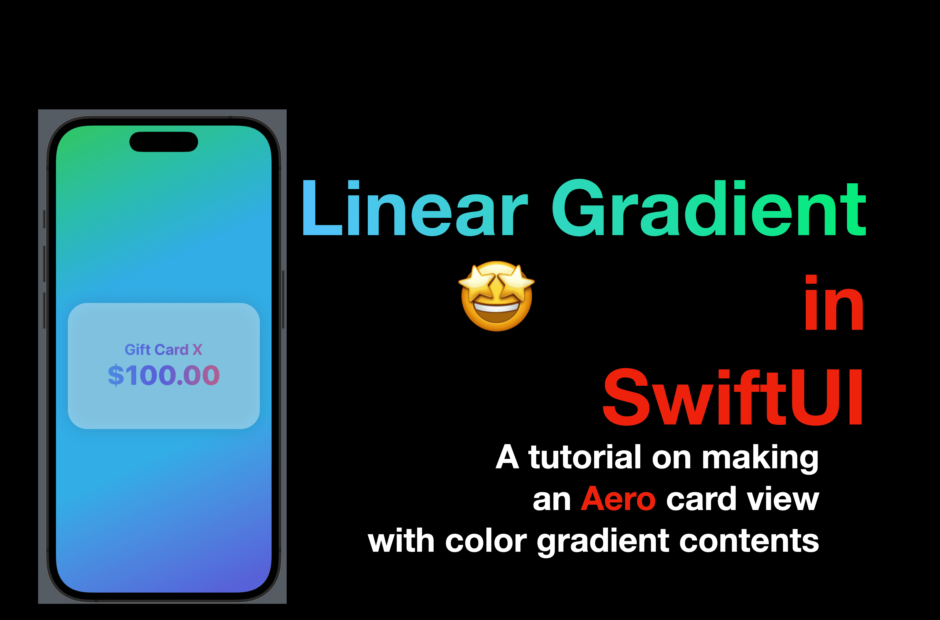
Hello coders! In my previous posts, I have utilized "Linear Gradient" in SwiftUI to produce text content or background colors that gradually change. Today, I will be showcasing how to incorporate this technique by creating a card view with an Aero effect, using opacity.
You can find the code for this post available here.
Introduction to Linear Gradient
LinearGradient is a public struct in SwiftUI and it conforms to the View protocol and the ShapeStyle protocol. And as its name suggests, it provides a style with a set of gradient colors, and the colors change gradually (linear change) from one side of the screen to another side.
Unit Point
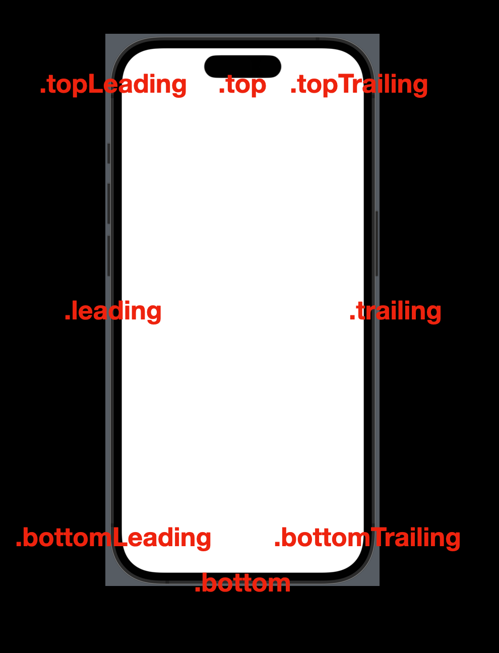
To create a linear gradient, we need to specify the direction the colors should change. And to specify a direction, we need a point of start and a point of end.
In SwiftUI, a location of a point on the screen of a device can be described by a unit point, with an x-value and a y-value. (Similar to the concept of the coordinates system we discussed, in the post "Custom Shapes in SwiftUI".)
SwiftUI also provides us with some static unit points so that we can use them directly:
top - the middle point of the top edge
bottom - the middle point of the bottom edge
leading - the middle point of the right-hand-side edge
trailing - the middle point of the left-hand-side edge
topLeading - the top-left corner
topTrailing - the top-right corner
bottomLeading - the button-left corner
bottomTrailing - the button-right corner
Colors
To create a linear gradient, we also need an array of Colors. If there’s only one color element in the array, we can still create a linear gradient, but the result doesn't look like a gradient.
To initialize a SwiftUI Color, we can use the following two frequently used initializers:
Color(red: Double, green: Double, blue: Double, opacity: Double). This method of generating a color is called RGB method, you can specify a value between 0-255 for each color, and give it an opacity from 0(invisible) to 1 (solid). !!!!!!!!!!NOTE: The values in this initializer require a double, and they expect the RGB value’s percentage over 255. For instance, if you want to create a color with RGB values as 100, 100 and 200 respectively, you need to pass 100 / 255, 100 / 255 and 200 / 255.
Color(name: String) - if you have a color set added to the Xcode asset, simply initialize a color with the color set name.
Instead of creating new color every time, you can also access a bunch of preset colors in SwiftUI such as .red, .blue, .green, .cyan, .indigo etc. Note: some colors are available in newer iOS versions, so double-check the availability before you use them.
Code Time
To create a linear gradient, we can use the initializer below, passing the values according to the instructions above.
LinearGradient(colors: [Color], startPoint: UnitPoint, endPoint: UnitPoint)
Now we have a general idea, it’s time to see it work in SwiftUI.
As mentioned above, LinearGradient is a View type; so let’s replace the default VStack in the ContentView with a linear gradient, as the code below:
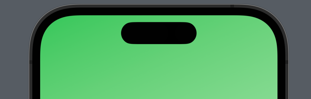
LinearGradient(colors: [.green, .white], startPoint: .topLeading, endPoint: .bottomTrailing)
The colors we have are green and white while the gradient starts from the top left corner and ends at the bottom right corner. So it looks like the screenshot below.
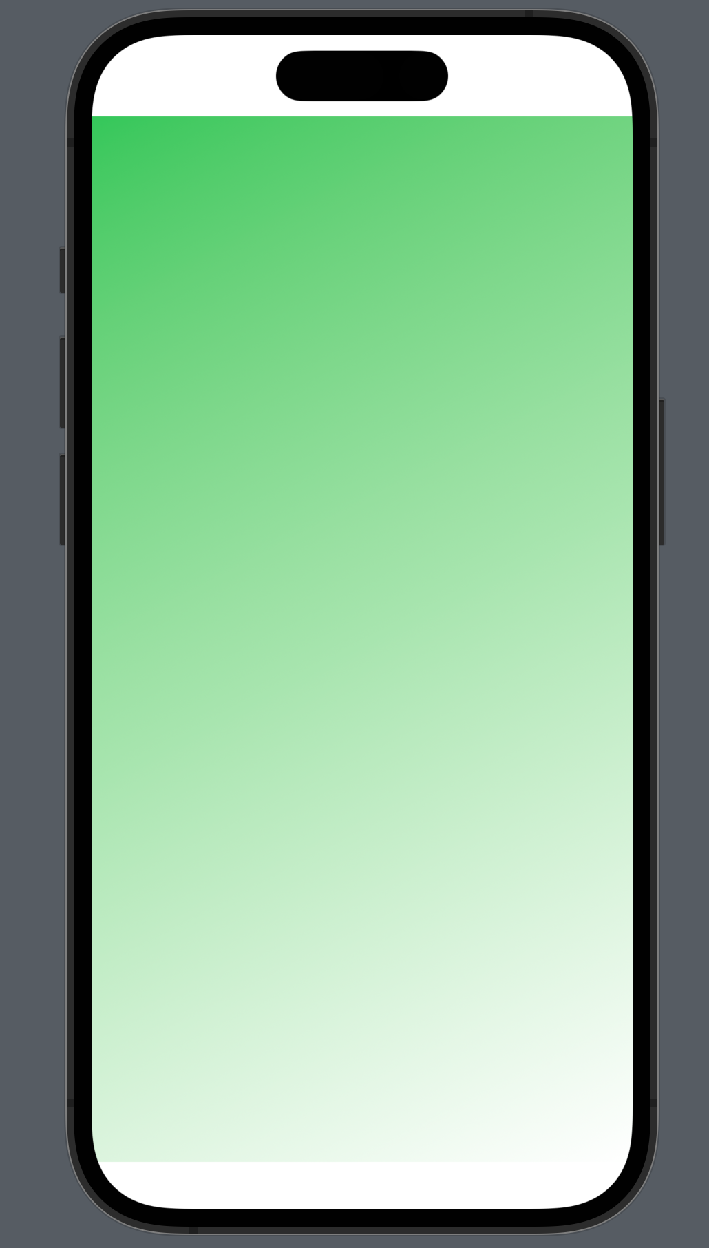
Note that the view won’t be placed in the safearea near the top and bottom edges of the screen. If this linear gradient is for a background, we can use a view modifier .ignoresSafeArea() to overwrite this default. Now the color should covers the whole screen.
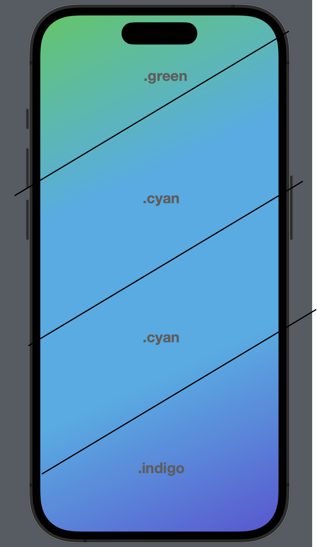
Now let’s change our code. This time, put two ".cyan" colors into the array, and replace ".white" to ".indigo".
LinearGradient(colors: [.green, .cyan, .cyan ,.indigo], startPoint: .topLeading, endPoint: .bottomTrailing)
            .ignoresSafeArea()
Since the colors are gradually changing, so repeated colors will take more spaces.
ZStack
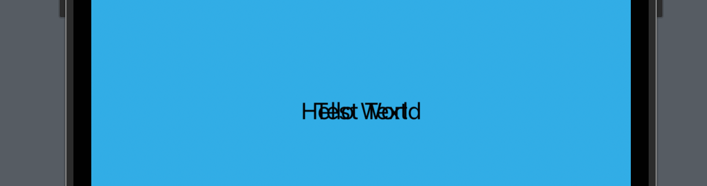
Since our card view will be "put above" the background, we can use a ZStack to wrap the line gradient we just created. To see how ZStack works, you can temporarily add two text views below the linear gradient.
        ZStack {
            LinearGradient(colors: [.green, .cyan, .cyan ,.indigo], startPoint: .topLeading, endPoint: .bottomTrailing)
                .ignoresSafeArea()
            Text("Test Text")
            Text("Hello World")
        }
Now you’ll see something like this - this step is just to demonstrate how ZStack works - elements in a ZStack will be put above its previous elements and that is why we can see the texts since they are above the background gradient, however, the texts are non-readable, because "Hello World" covers "Test Text".
Card Background - Rounded Rectangle
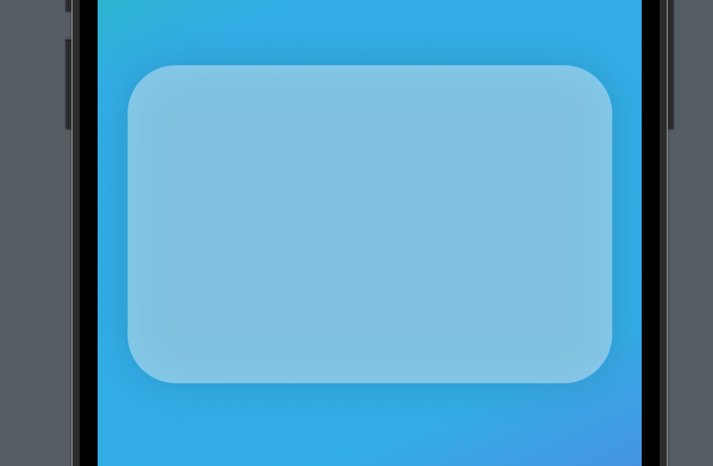
Now remove the text views added just now and add a Rounded Rectangle after the linear gradient. If you’re not familiar with shapes, you can check a previous post about them here.
This rounded rectangle has a corner radius of 35 and a white foreground color.
Note that this white color has a modifier called opacity, the concept of which was introduced in the color section above. And the difference is: this .opacity is a view modifier that updates the color as a view, instead of a parameter of the color initializer.
Then give the rounded rectangle a frame to resize it. And finally, apply a shadow with a radius of 15. Typically, the higher the shadow radius is, the larger it covers, and the less it is visible.
ZStack {
    LinearGradient(colors: [.green, .cyan, .cyan ,.indigo], startPoint: .topLeading, endPoint: .bottomTrailing)
        .ignoresSafeArea()
    RoundedRectangle(cornerRadius: 35)
        .foregroundColor(Color.white.opacity(0.4))
        .frame(width: 350, height: 230)
        .shadow(radius: 15)
}
Once done, you can see a nice card background in the preview canvas.
Card View Content
And now what we need is some text above the card view background, which should be with a linear gradient too.
To realize that, we need a view modifier called .mask, which will apply the opacity of another view to the view calling this modifier.
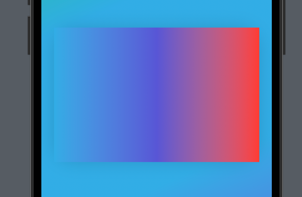
Now let’s add another linear gradient above the card view background, and give it a frame to resize it, with the same width and height as the rounded rectangle.
LinearGradient(colors: [.cyan, .indigo, .red], startPoint: .leading, endPoint: .trailing)
    .frame(width: 350, height: 230)
Now this new linear gradient, with a width of 250 and a height of 230, will cover the rounded rectangle since it comes after the rounded rectangle.
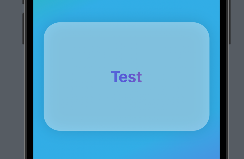
And now, add the .mask modifier to the linear gradient we added just now, and in the closure, put a simple text view as a placeholder. Make it bold with a font of largeTitle so that it’ll be easier to tell the result.
LinearGradient(colors: [.cyan, .indigo, .red], startPoint: .leading, endPoint: .trailing)
    .frame(width: 350, height: 230)
    .mask {
        Text("Test")
            .font(.largeTitle)
            .bold()
    }
You can see that the mask works as expected.
Now let’s replace the placeholder test view with the VStack below.
It contains two text views. The first text tells the user what the information on the screen is and the other is a number 100 formatted as a "USD" currency.
.mask(
    VStack {
        Text("Gift Card X")
            .font(.title)
            .bold()
        Text(100.formatted(.currency(code: "USD")))
            .font(.system(size: 50, weight: .heavy))
            .bold()
    }
)
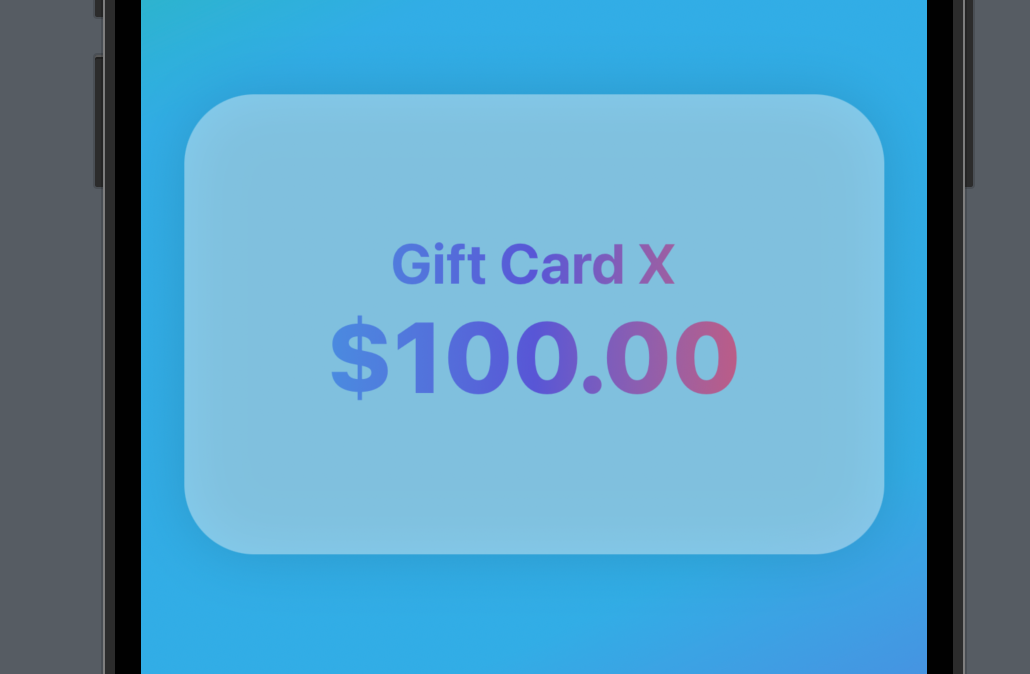
Now the card view is done! I hope you got an idea about Linear gradient, ZStack, and the mask modifier.
If you like this tutorial, please remember to hit the like button or leave a comment. To get more posts like this via email, subscribe to my newsletter. I’ll see you all in the next post.