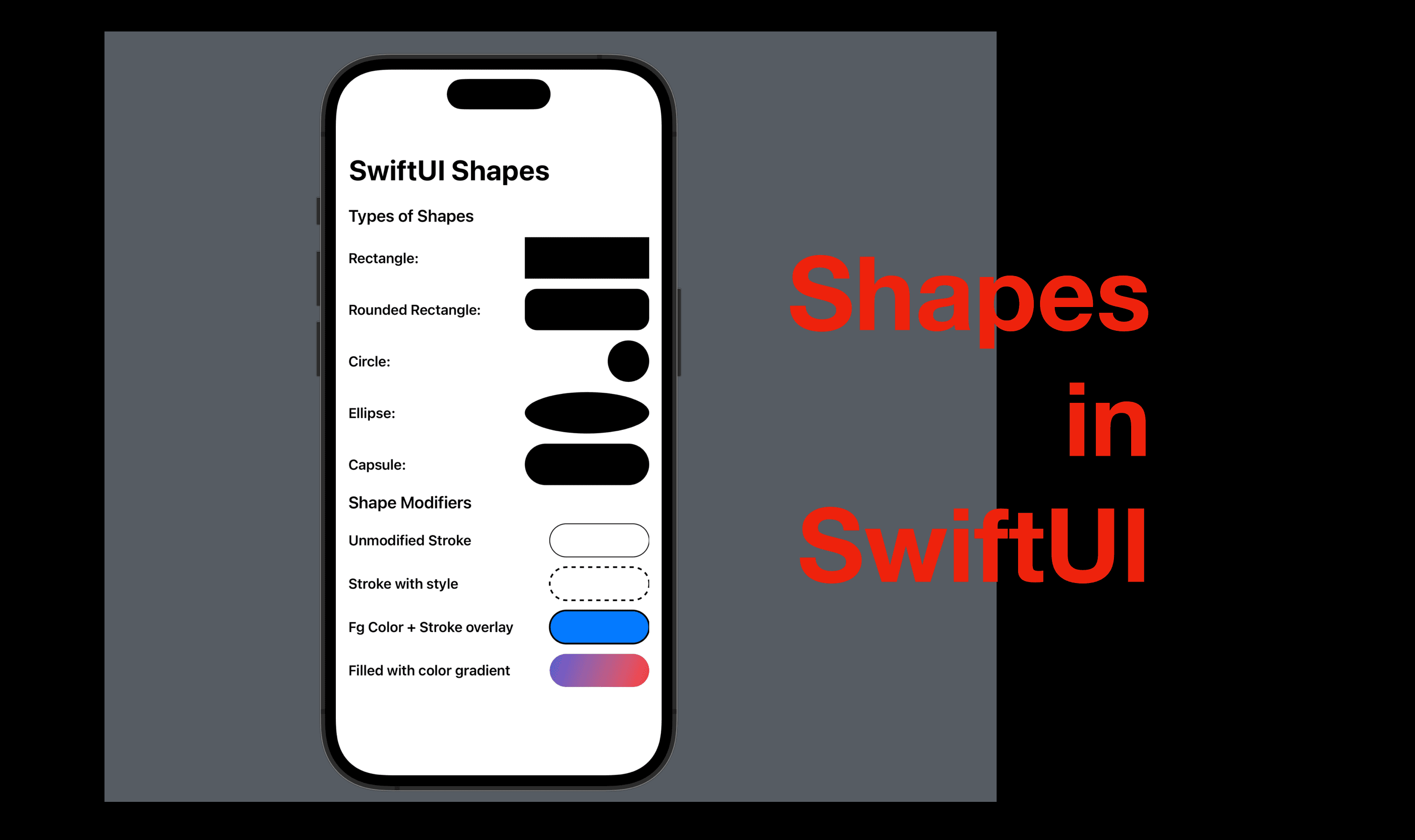
SwiftUI Shapes
Hi all, today I’d like to share a summary of standard shapes in SwiftUI. If you’re interested in custom shapes as well, leave a comment below and I’ll do another post.
The code of this post is available here.
Overview
Shape is a public protocol in SwiftUI since iOS 13 and the Shape protocol itself conform to another two protocol: Animatable and (SwiftUI) View.
SwiftUI provides us with several standard view structures that conform to the Shape protocol, and let’s take a look at what they are and how to style them with view modifiers.
Shape View Structures
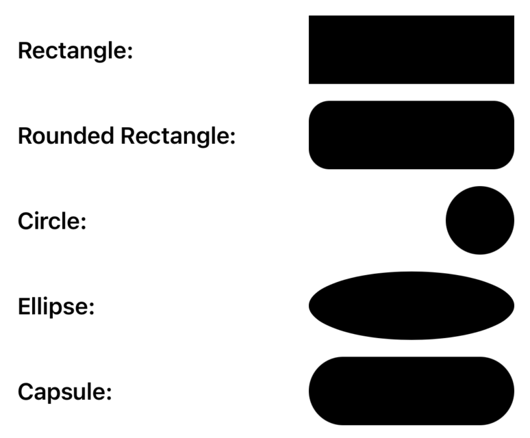
Except for Path structure which is often used for creating custom shapes, there’s are five shape views, and they can be grouped into two categories:
Rectangular shapes: Rectangle, Rounded Rectangle.
Circular shapes: Circle, Ellipse, Capsule.
We can initialize these shapes without any parameter, and control the size of such shapes with the view modifier frame. The only exception is the Rounded rectangle, the initializer of which has a parameter of cornerRadius.
Note that theCapsule and Rounded Rectangle structures are different from each other. A rounded rectangle is a variant of the rectangle, with a corner radius and it is a rectangular shape. On the contrary, a capsule is a circular shape, like an outline of the dynamic island of an iPhone 14 Pro.
VStack {

    //MARK: Rectangular shapes
    HStack {
        Text("Rectangle" + ":").bold()
        Spacer()
        Rectangle()
            .frame(width: 150, height: 50)
    }
    HStack {
        Text("Rounded Rectangle" + ":").bold()
        Spacer()
        RoundedRectangle(cornerRadius: 15)
            .frame(width: 150, height: 50)
    }
    //MARK: Circular shapes
    HStack {
        Text("Circle" + ":").bold()
        Spacer()
        Circle()
            .frame(width: 50, height: 50)
    }
    HStack {
        Text("Ellipse" + ":").bold()
        Spacer()
        Ellipse()
            .frame(width: 150, height: 50)
    }
    HStack {
        Text("Capsule" + ":").bold()
        Spacer()
        Capsule()
            .frame(width: 150, height: 50)
    }
    HStack {
        Text("Shape Modifiers")
            .font(.title3)
            .bold()
        Spacer()
    }
}
View modifiers for the shapes
Frame
As demonstrated above, the frame modifier can be used to control the size of a shape since it’s putting a shape inside an invisible rectangular view.
For instance, in the following code snippet, there are two circle shapes declared. Circle1 and Circle2 will look exactly the same, with a radius of 50. However, since circle2 is put inside a wider frame, the space it takes will be wider.
let circle1 = Circle().frame(width: 50, height: 50)
let circle2 = Circle().frame(width: 150, height: 50)
Stroke
The stroke view modifier adds an outline/ a borderline for the view it modifies. We can also make it dashed with a StrokeStyle as a parameter. The stroke style has a line width and a dash that are both customizable.
HStack {
    Text("Unmodified Stroke").bold()
    Spacer()
    Capsule()
        .stroke()
        .frame(width: 120, height: 40)
}
HStack {
    Text("Stroke with style").bold()
    Spacer()
    Capsule()
        .stroke(style: StrokeStyle(lineWidth: 2, dash: [5]))
        .frame(width: 120, height: 40)
}

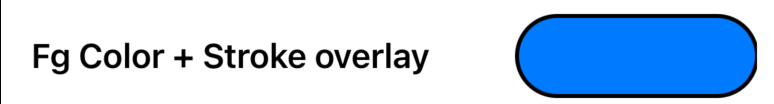
Foreground Color & Overlay
The modifier foregroundColor sets the foreground color of the shape it modifies, as its name suggests, the parameter we need is a SwiftUI color.
We covered the stroke modifier in the section above. But what if we need a shape with a foreground color and a border? In this case, we can add an overlay with the same shape inside, with a stroke modifier.
HStack {
    Text("Fg Color + Stroke overlay").bold()
    Spacer()
    Capsule()
        .frame(width: 120, height: 40)
        .foregroundColor(.accentColor)
        .overlay {
            Capsule().stroke(lineWidth: 2)
        }
}
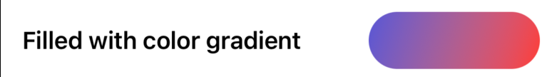
Fill
Sometimes, we need to have gradient color in our shape and foregroundColor won’t be able to do that since it requires a SwiftUI color. In this case, we can use a fill modifier instead of foregroundColor, so that the fill contents can be further customized.
For instance, the following code snippet has a Capsule modified by fill. Inside the full modifier, a LinearGradient is defined, with two colors - indigo and red, the gradient direction is from top leading (left) to bottom trailing (right).
HStack {
    Text("Filled with color gradient").bold()
    Spacer()
    Capsule()
        .fill(LinearGradient(colors: [.indigo, .red], startPoint: .topLeading, endPoint: .bottomTrailing))
        .frame(width: 120, height: 40)
}
Well, that’s all for this summary of standard SwiftUI shapes. If you find it useful, don’t forget to hit the like button and subscribe to my newsletter. I’ll see you in the next post.\