Custom Toggle (Switch) in SwiftUI
How to create a toggle in SwiftUI from scratch
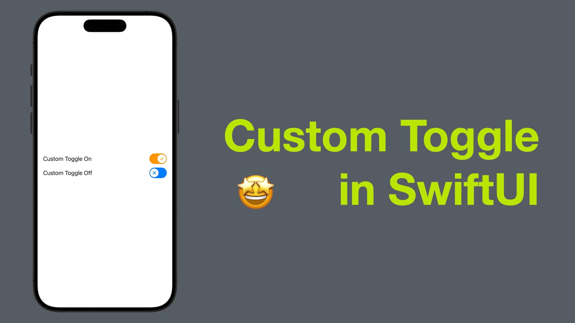
Hi there, long time no see! Today I’m going to demonstrate how to create a custom toggle in SwiftUI from scratch.
With a custom toggle, you have the freedom to imbue your interface with a distinctive personality that aligns perfectly with your brand or app theme. Beyond aesthetics, customization grants you precise control over the behavior and animations of the toggle, ensuring a seamless and engaging user experience.
Without further ado, let’s get started.
PS: The code in this post is available here.
Step 1: Set up basic toggle view skeleton and content view for preview
Create a ToggleView struct that conforms to View.
In side Toggle View’s body, create a HStack that contains a Text, a Spacer and a RoundedRectangle.
Add a
textproperty that allows we pass a text to the toggle.Make the corner radius for the rounded rectangle large to make the edges smoother. You can also replace it with a
Capsuleif you prefer.Add a binding bool called
isOn, which reads and writes a bool from outside.Alter the foreground color of the rounded rectangle based on
isOn, using an ternary operatorisOn ? onColor : offColor. Ideally the color should be configurable, for this tutorial, we’ll keep it simple and use.orangeand.accentColor.
    struct ToggleView: View {
        let text: LocalizedStringKey
        @Binding var isOn: Bool
        var body: some View {
            HStack {
                Text(text)
                Spacer()
                RoundedRectangle(cornerRadius: 50)
                    .foregroundColor(isOn ? .orange : .accentColor)
                    .frame(width: 51, height: 31)
                    .onTapGesture { isOn.toggle() }
            }
        }
    }
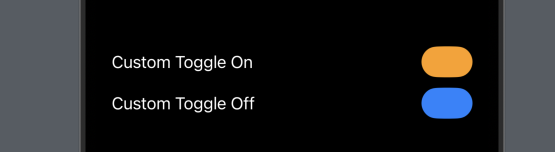
In the content view, create two toggles and pass a constant true and false for the binding so that we can easily see how the view looks when toggle is on and off at the same time.
    struct ContentView: View {
        var body: some View {
            VStack {
                ToggleView(text: "Custom Toggle On", isOn: .constant(true))
                ToggleView(text: "Custom Toggle Off", isOn: .constant(false))
            }
            .padding()
        }
    }
Below is how it looks as of now. Next step is to add a circle to indicate the toggle state (on or off).
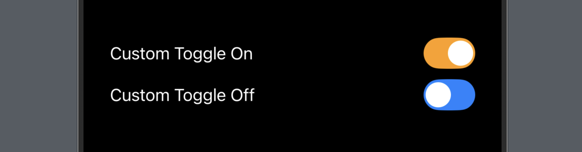
Step 2 - Circle Overlay
To show if the toggle is on or off, we need a circle (or another shape you prefer) a horizontal offset.
Add a computed property that determines the offset based on
isOn. i.e.var circleOffset: CGFloat { isOn ? 11: -11 }Add an overlay for the rounded rectangle. Inside the overlay, add a circle with x offset of the offset defined above.
    struct ToggleView: View {
        let text: LocalizedStringKey
        @Binding var isOn: Bool
        // -------------- New in Step 2
        private var circleOffset: CGFloat {
            isOn ? 11 : -11
        }
        var body: some View {
            HStack {
                Text(text)
                Spacer()
                RoundedRectangle(cornerRadius: 50)
                    .foregroundColor(isOn ? .orange : .accentColor)
                    .frame(width: 51, height: 31)
                    // -------------- New in Step 2
                    .overlay(
                        Circle()
                            .frame(width: 25,
                                   height: 25)
                            .foregroundColor(.white)
                            .padding(3)
                            .offset(x: circleOffset)
                    )
            }
        }
    }
Now the circle will pushed to right hand side when toggle is on and left hand side if toggle is off.
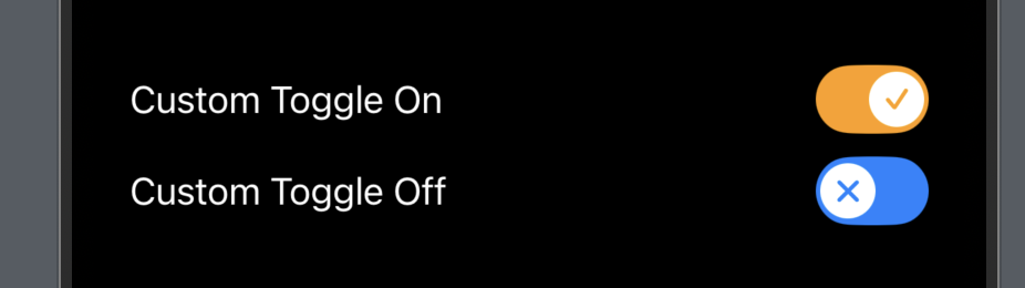
Step 3 - Image Overlay for the Circle (Optional)
This step is optional. If you want, you can also provide a small icon as an overlay of the circle. This icon will definitely look better if its color is changing based on the toggle state.
Below is an example using "checkmark" and "xmark" SF symbol.
Circle()
    .frame(width: 25,
           height: 25)
    .foregroundColor(.white)
    .padding(3)
    // -------------- New in Step 3
    .overlay(
        Image(systemName: isOn ? "checkmark" : "xmark")
            .resizable()
            .aspectRatio(contentMode: .fit)
            .font(.title.weight(.bold))
            .frame(width: 10,
                   height: 10)
            .foregroundColor(isOn ? .orange : .accentColor)
    )
    .offset(x: circleOffset)
Step 4 - Simple but important logic
As a toggle, don’t forget to change the binding bool value when it’s tapped.
So add an onTapGesture for the RoundedRectangle. To ensure smooth transition, we can also give it a faster animation.
RoundedRectangle(cornerRadius: 50)
    .foregroundColor(isOn ? .orange : .accentColor)
    .frame(width: 51,
           height: 31)
    .overlay(
        Circle()
            .frame(width: 25,
                   height: 25)
            .foregroundColor(.white)
            .padding(3)
            .overlay(
                Image(systemName: isOn ? "checkmark" : "xmark")
                    .resizable()
                    .aspectRatio(contentMode: .fit)
                    .font(.title.weight(.bold))
                    .frame(width: 10,
                           height: 10)
                    .foregroundColor(isOn ? .orange : .accentColor)
            )
            .offset(x: circleOffset)
    )
    // -------------- New in Step 4
    .animation(.linear(duration: 0.15), value: isOn)
    .onTapGesture { isOn.toggle() }
And that’s it! Our toggle is done.
One more thing, in this tutorial, we hardcoded the on and off colors, label as a text etc, actually these can all be a parameter so that the toggle is more customizable, and you can then pass a view as the label instead of a string/localized string key, or pass two colors for design the rounded rectangle color, or even the image/icon on the circle. But I believe this post can give you an idea of the basic customization.
That’s everything for this post.
Don’t forget to subscribe to my newsletter if you’d like to receive posts like this via email. If you like my posts, 😚consider tipping me at buymeacoffee.com/xavierios.