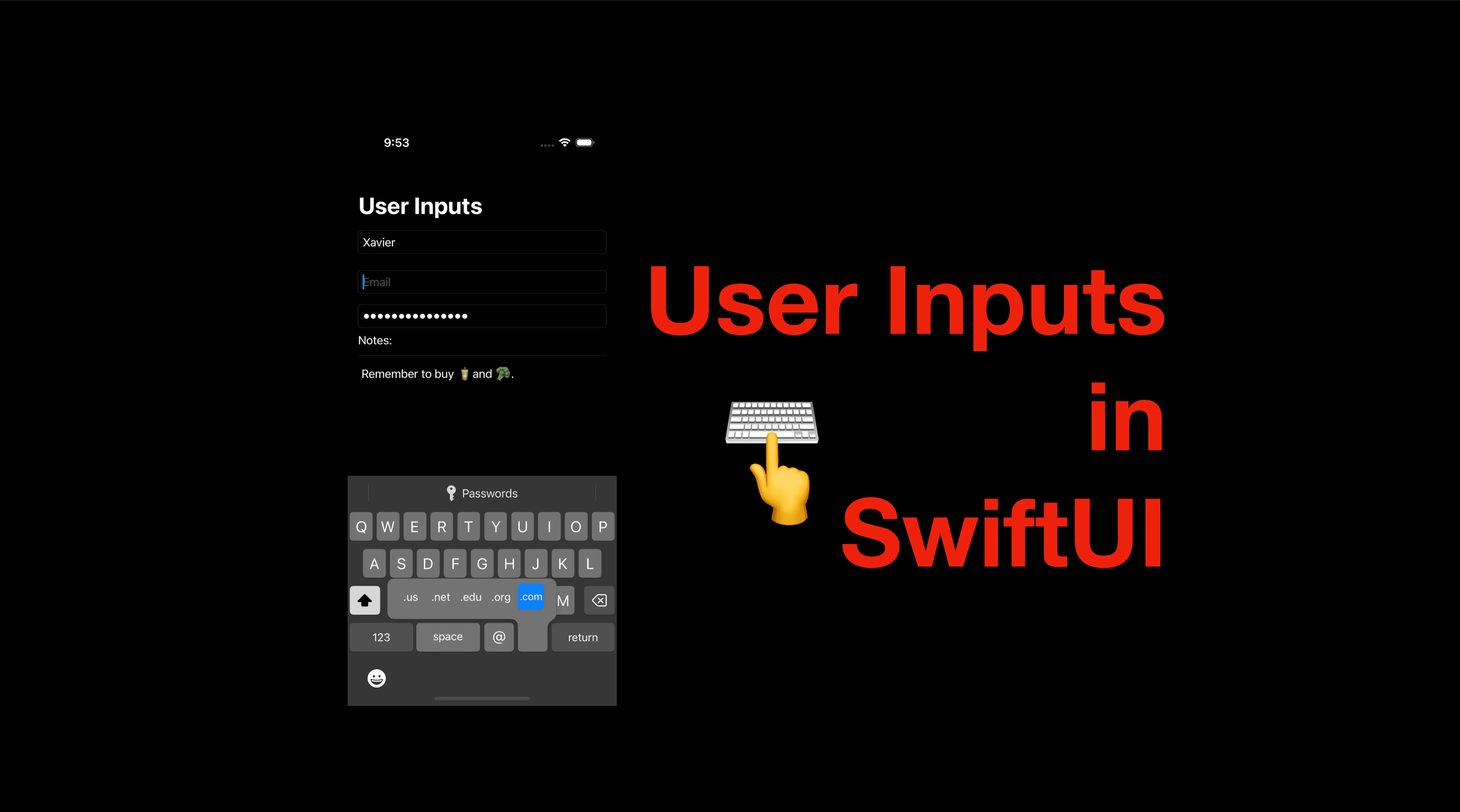
User Inputs in SwiftUI
Hi all, today I’m going to demonstrate how to handle user inputs in SwiftUI. This might sound simple, however, there’re a lot of details to pay attention to. For instance, let’s look at the questions below:
do we need to hide inputs for passwords?
what if the app needs a looooooong text?
can I add a border for a text field?
what should be on the "return" button for the users to press when they finish typing?
how can I change the keyboard for different contents? Say numbers only, numbers with decimals, email addresses, phone numbers or websites. They all should have a different keyboard layout right?
how can I run some code when the input value changes?
The code of this post is available here.
Types of Fields
There are three types of fields in SwiftUI - TextField, SecureField and TextEditor. They are all SwiftUI views so we can use them as other views.
Typically, most of the user inputs of a piece of smalled-sized information can be handled with a TextField, while SecureField can be used for inputs of confidential information such as passwords or one-time verification codes. And for longer inputs such as a note, comment or review, TextEditor will be the most suitable choice.
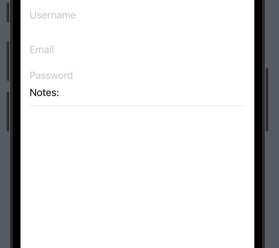
Let’s create a ScrollView with two Textfields, a SecureField and a TextEditor and they’ll be used for entering "User name", "Email", "Password" and "Note" respectively.
struct ContentView: View {
    @State private var usernameInput: String = ""
    @State private var emailInput: String = ""
    @State private var passwordInput: String = ""
    @State private var noteInput: String = ""
    var body: some View {
            ScrollView {
                TextField("Username", text: $usernameInput)
                    .frame(minHeight: 50)
                TextField("Email", text: $emailInput)
                    .frame(minHeight: 50)
                SecureField("Password", text: $passwordInput)
                HStack {
                    Text("Notes" + ":")
                    Spacer()
                }
                Divider()
                TextEditor(text: $noteInput)
            }
            .padding(.horizontal, 15)
            .navigationTitle("User Inputs")
    }
}
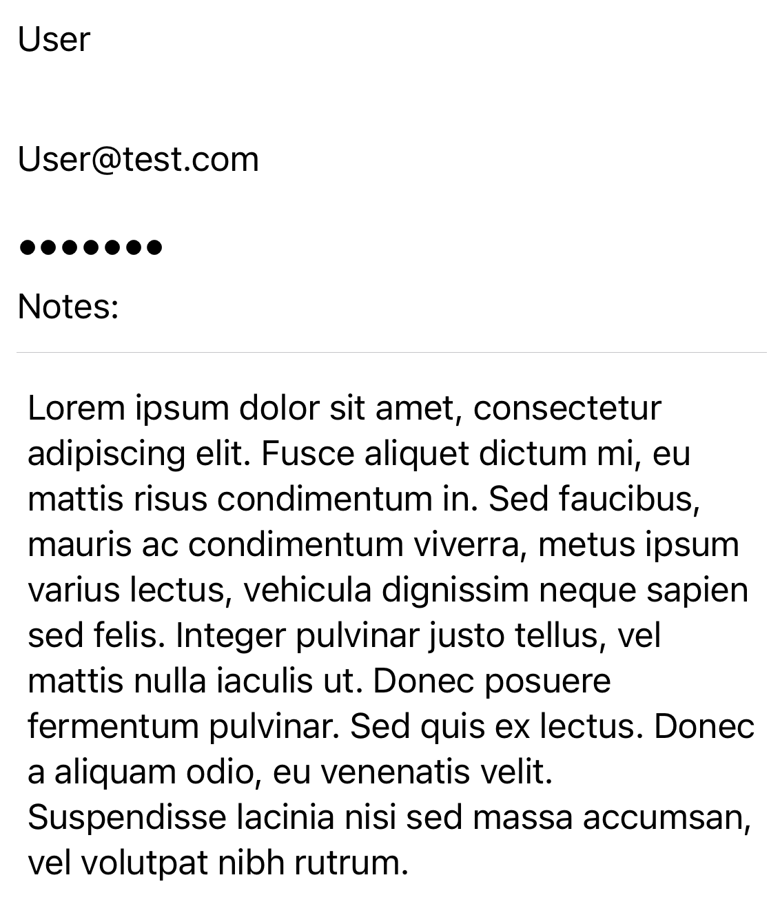
Let’s enter some values and see the differences mentioned above:
Borders
To add a border to a text field, we can use the modifier textFieldStyle, and pass a value .roundedBorder. Another option of style is called .plain and it makes the field look the same as if it doesn’t have a border.
TextField("Username", text: $usernameInput)
    .textFieldStyle(.plain)
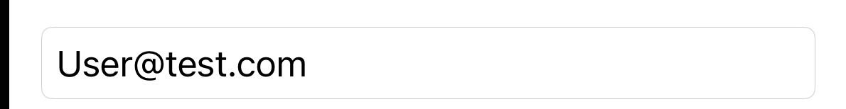
A text field without the .textFieldStyle modifier and the code above (with plain field style) both look like the screenshot below:

Now let’s look at a text field with a rounded border-style:
TextField("Username", text: $usernameInput)
    .textFieldStyle(.roundedBorder)

And of course, we can add a custom border with the view modifier overlay with a stroked rounded rectangle. (For more about shapes, check out this post.)
Auto-capitalization & auto-correction
Notice that while we enter a name in the "Username" text field, iOS automatically detects "typos" and highlights the input. What’s worse, it’s going to "fix" the typo.
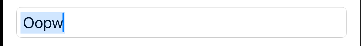
To disable auto-correction, we can add the modifier .autocorrectionDisabled(true).
Similarly, certain fields expect all lowercased letters, we don’t want the auto-capitalization enabled either.
In such a case, we can use .textInputAutocapitalization(.never) to disable auto-capitalization. If needed, we can also use the value .word, .sentence to set the capitalization rule.
Keyboard Type
Speaking of email, the keyboard will be more user-friendly if the @ character is available without having to switch to special characters. To realize this, we can add the following modifier to the text fields for email addresses.
.keyboardType(.emailAddress)

Similarly, we can pass a .URL for websites, .phonePad for phone numbers (with # and *), .numberPad for numeric inputs, .decimalPad for currency/amount inputs.
Return Type
The "return" key is the button on the keyboard pressed when the input finishes. And the label "return" doesn’t make sense sometimes. For instance, in a browser, if the user typed some keywords to search, the label should be "search" instead of "return".
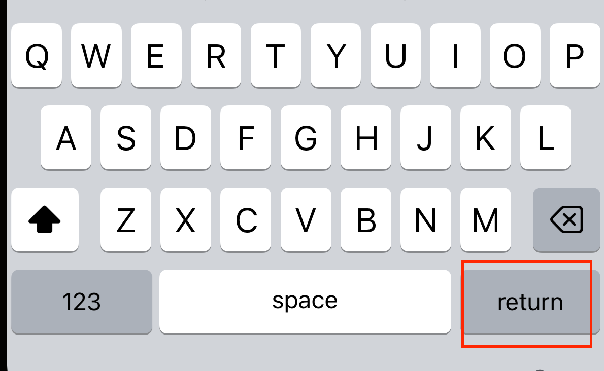
SwiftUI also provides us with a view modifier .submitLabel and we can use values such as .search, .next, .continue, .join.
On-Submit or On-Change Action
To call a function or perform certain actions when the "return" key is pressed, we can use .onSubmit with a closure of code to execute.
For instance, if the password field is the last input field on a sign-up screen, we can perform validation/user creation with .onSubmit. Instead of offering another "Continue" button.
SecureField("Password", text: $passwordInput)
    .textFieldStyle(.roundedBorder)
    .submitLabel(.continue)
    .onSubmit {
        // validation code goes here
    }
Another situation of actions is on-change: for instance, if the field is for searching, we might need to fetch filtered data every time the input value changes.
.onChange(of: <#valueToMonitor#>) { newValue in
    // process the new value here
}
And that’s all of this post. I hope it helped you get a better understanding of types of fields and their implementation in practice.
If you like this post please hit the like button and don’t forget to subscribe to my newsletter. I’ll see you all in the next post.