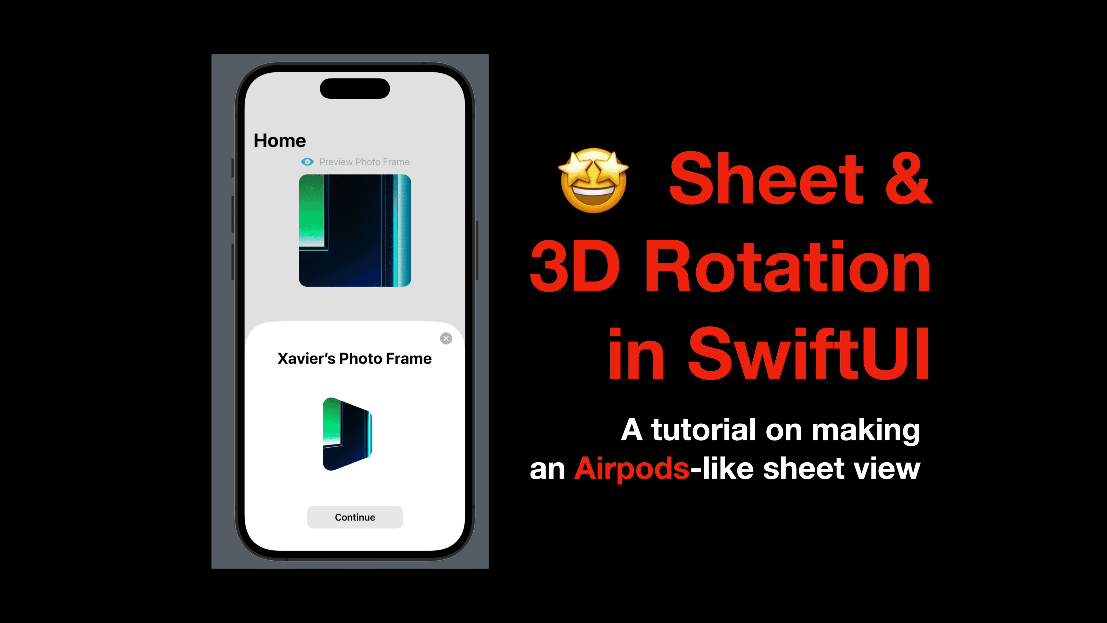
SwiftUI Sheet and 3D Rotation
A tutorial on making a Sheet like an Airpods view
Yesterday, we learned about grid view and various ways to create grid items and with these concepts, we created a grid view like the home page of Pinterest. Today, we’re going to explore sheets and 3D rotation effects on a SwiftUI view. Let’s get started.
The code of this post is available here.
Environment: Xcode 14.3 beta 2 (14E5207e), iOS 16.4. (Note: in today’s demo, there’s one line of code - for the corner radius of the sheet, which is only available in iOS 16.4+. If you’re not with iOS 16.4 beta just yet, it’s totally fine and can still follow other content).
Context
In today’s demo, we’re going to create a "Home" view, with an image and a button. This image will be used to produce a framed photo for the user. The user can press the button to see a rotating 3D animation of the image, in a sheet presented until around halfway to the top of the screen. (As you can tell from the cover image of this post).
Step 1 - Add an image to your project assets
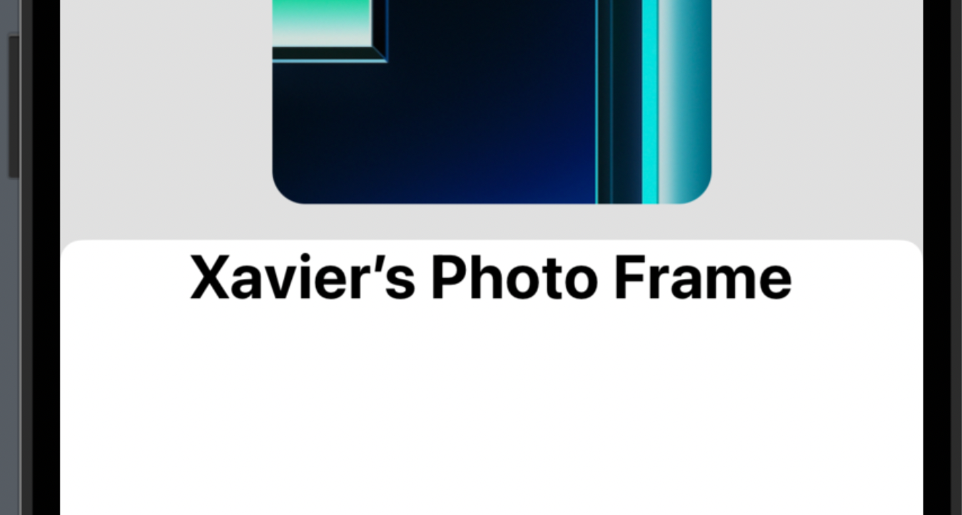
Before we start coding, drag your favorite image and drag it from Finder and drop it inside Xcode, under Assets.xcassets. Rename it if necessary and remember the name you give it. For this demo, my image is called demo so it’s going to be in part of the code later.
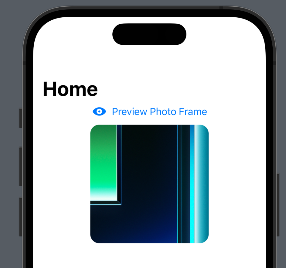
Step 2 - Create a home view and add elements
Now, inside the content view of your project, replace the default VStack with a NavigationStack or NavigationView, with a ScrollView in it and give the scroll view a navigation title "Home".
Then inside the scroll view, let’s add two elements we needed:
A button - this button will be used to toggle the sheet but for now, just keep the action as a simple
printstatement, and give it a label titled "Preview Photo Frame" with asystemImageof"eye.fill"as a preview icon.An image - this is the image you added just now, but embedded in the home view. Before adjusting the size of it, we need to enable resizing ability with the view modifier
.resizable()and then use a frame to resize it by specifying a specific width and height. Optionally, you can clip it and use a clip shape of a rounded rectangle to give the image four rounded corners. If you’re not quite familiar with SwiftUI shapes in one of my previous posts here.
struct ContentView: View {
    var body: some View {
        NavigationStack {
            ScrollView {
                Button {
                    print("Button Tapped")
                } label: {
                    Label("Preview Photo Frame", systemImage: "eye.fill")
                }
                Image("demo")
                    .resizable()
                    .frame(width: 200, height: 200, alignment: .center)
                    .clipped()
                    .clipShape(RoundedRectangle(cornerRadius: 15))
            }
            .navigationTitle("Home")
        }
    }
}
Now your preview provider should looks like the screenshot below, with the image of your choice.
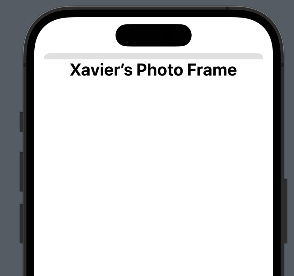
Step 3 - Create an empty Sheet
Before we can present a sheet after the button is tapped, we need to create one. Now let’s create an empty sheet view. It can be a separate structure of SwiftUI view, or you can make it a property inside your content view, of the type some View.
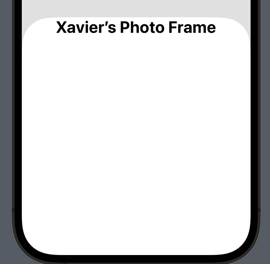
My implementation below is to create the sheet view as a property inside the content view. So if you’d like to do it the same way, add the code below after the body property in the content view. For now, we’re using a VStack with a text view and a spacer as the placeholders for sheet view contents. We’ll get back to this view later.
    var sheet: some View {
        VStack {
            Text("Xavier’s Photo Frame")
                .font(.title)
                .bold()
            Spacer()
        }
    }
Step 4 - Toggle the Sheet View
Now let’s try to present the sheet when the button is tapped.
To do this, we need a @State bool value to tell the view whether it should present the sheet. So add the bool as shown below, within your content view. Give it a default value of false because we need to present the sheet only after the button is tapped.
@State private var showSheet: Bool = false
Now let’s replace the print statement in the button action with the code below. .toggle() function of a boolean basically reverses its value - if it’s true, set it to false and if it’s false, set it to true.
showSheet.toggle()
We already told the view when the button is tapped and it should present the sheet view; the question is: how can the view receive the information and which sheet should be presented?
To solve this, add a .sheet modifier after the button. This modifier requires two parameters:
isPresented: a binding bool, which is the binding value of the state bool we created above;content: the sheet view you’d like to present. In our case, the content will be the
sheetproperty in the Content View.
Button {
    showSheet.toggle()
} label: {
    Label("Preview Photo Frame", systemImage: "eye.fill")
}
.sheet(isPresented: $showSheet) {
    sheet
}
Now when you press the button, you should be able to see the sheet get presented.
Step 5 - Configuration of the Sheet View Presentation
Now you might be wondering: shouldn’t the sheet be smaller? I don’t see a sheet going all the way up when I open my Airpods. And how come you don’t have a corner radius on the sheet view?
These are exactly what we’re going to tackle in step 5.
presentationDetents (available iOS 16.0+)
presentationDetents is a view modifier we can use on a view to be presented as a sheet. It controls the height of the sheet. The parameter is an array of PresentationDetent, with default values such as medium and large available.
Let’s try adding this modifier with a .medium as the only item in the array.
Button {
//...
} label: {
//...
}
.sheet(isPresented: $showSheet) {
    sheet
    .presentationDetents([.medium])
}
You can see that the sheet won’t go up to the top and stays near the middle.
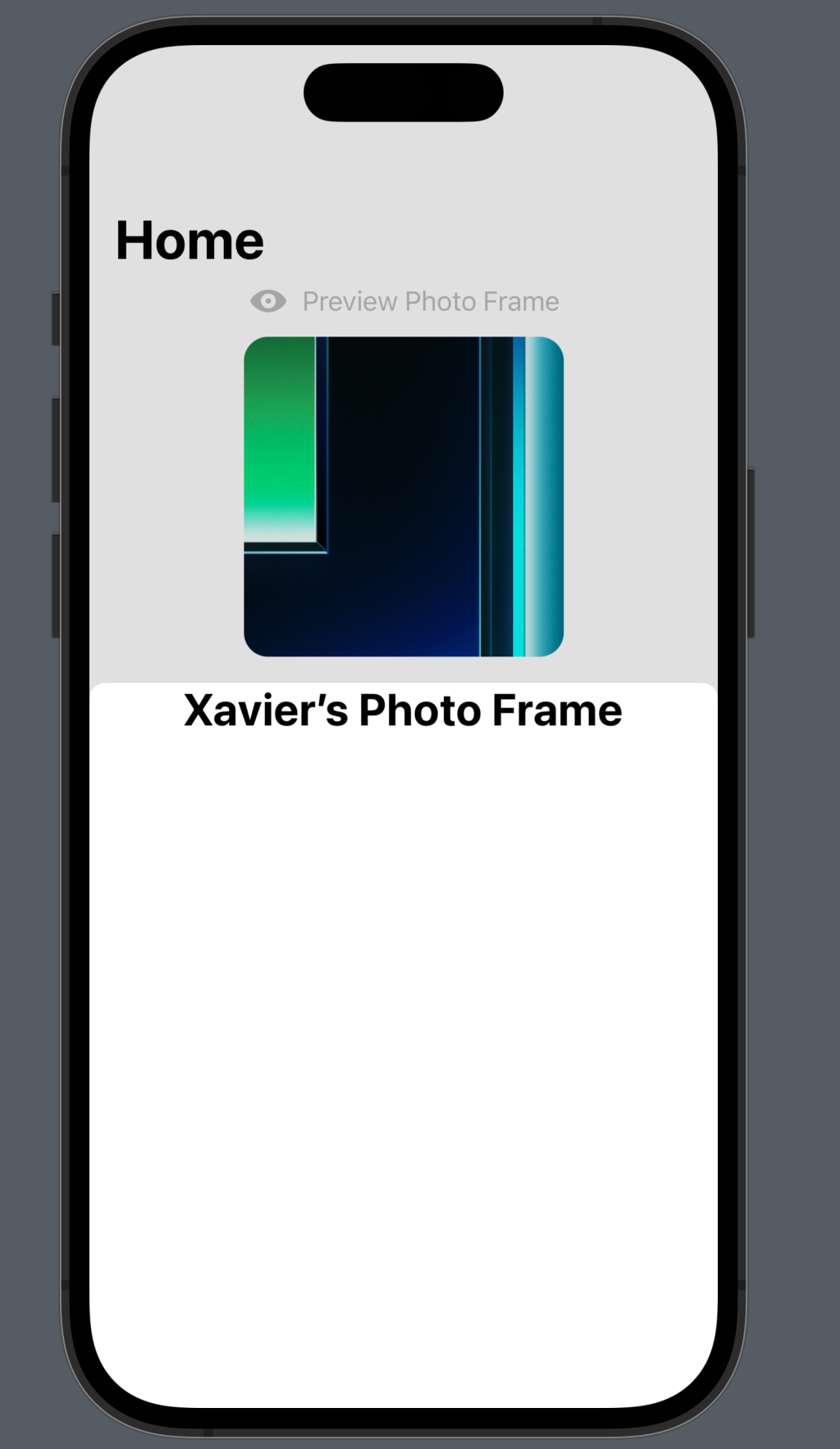
Note: The option .large is the default value. And what if we pass an array with both values? In such a case, the sheet will be presented halfway in the middle and will continue going up if the user swipes it upwards. Pretty cool right?
Another note: apart from the default values such as .middle and .large, we can customize the height with .fraction(double) . Let’s use this in our sheet view.
Button {
    showSheet.toggle()
} label: {
    Label("Preview Photo Frame", systemImage: "eye.fill")
}
.sheet(isPresented: $showSheet) {
    sheet
   //.presentationDetents([.medium])
   .presentationDetents([.fraction(0.50)]) // iOS 16.0 +
presentationCornerRadius (available iOS 16.4+)
And let’s move on to the second question - regarding the corner radius. This is what the top edge of the sheet view looks like.
With the modifier called presentationCornerRadius, we can make the corners look more rounded. Now let’s add it below the "detents" modifier, and pass a value of 50.
sheet
.presentationDetents([.fraction(0.50)]) // iOS 16.0 +
.presentationCornerRadius(50) // iOS 16.4 +
You can see now that edges are more rounded and look much more like the Airpods sheet. 😊
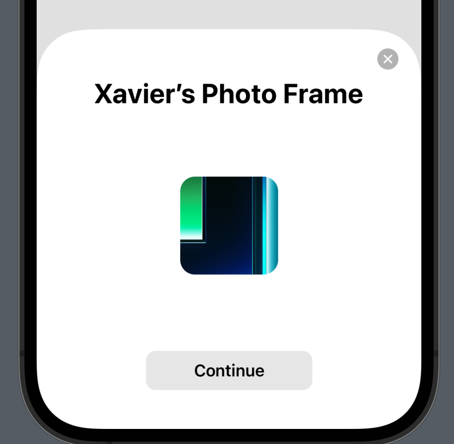
Step 6 - Add Elements to the Sheet View
Time to work on the sheet!
Replace the placeholder we added in Step 3 with a Navigation Stack or Navigation View.
Inside the navigation stack/view, add a VStack with a Toolbar containing a close button, which is a gray-colored circled x-mark icon, and toggles
showSheetboolean when you tap it.Inside the VStack, add a text title, add your image, resized and clipped, and then add a continue button with a gray background.
Check the preview canvas and adjust the layout with paddings, if needed.
NavigationStack {
    VStack {
        Text("Xavier’s Photo Frame")
            .font(.title)
            .bold()
            .padding(.top, 60)
        Image("demo")
            .resizable()
            .frame(width: 100, height: 100)
            .clipped()
            .clipShape(RoundedRectangle(cornerRadius: 15))
            .padding(.vertical, 50)
        Button {
            showSheet.toggle()
        } label: {
            Text("Continue")
                .foregroundColor(.primary)
                .bold()
                .frame(width: 170, height: 40)
                  .background(Color.primary.opacity(0.1).cornerRadius(10))
                .padding(.vertical, 20)
        }
        Spacer()
            .padding(.bottom, 45)
    }
    .toolbar {
        ToolbarItem(placement: .navigationBarTrailing) {
            Button {
                showSheet.toggle()
            } label: {
                Image(systemName: "xmark.circle.fill")
                    .foregroundColor(.primary.opacity(0.3))
                    .padding(.trailing, 5)
                    .padding(.top, 5)
            }

        }
    }
}
Now the sheet looks like the screenshot below.
Step 7 - Add 3D rotation and Animation to the image
Final step - add animation with 3D rotation effect.
Let’s take a look at how to rotate a view in three-dimensional spaces.
rotation3DEffect
rotation3DEffect is a view modifier where you can rotate a view with the x, y, or z axis as the center, with a specified degree.
Since we need the image to rotate horizontally, the center should be the y-axis. Let’s add the modifier to the image and see the result.
Image("demo")
//...
//...
.clipShape(RoundedRectangle(cornerRadius: 15))
.rotation3DEffect(.degrees(60), axis: (x: 0, y: 1, z: 0))
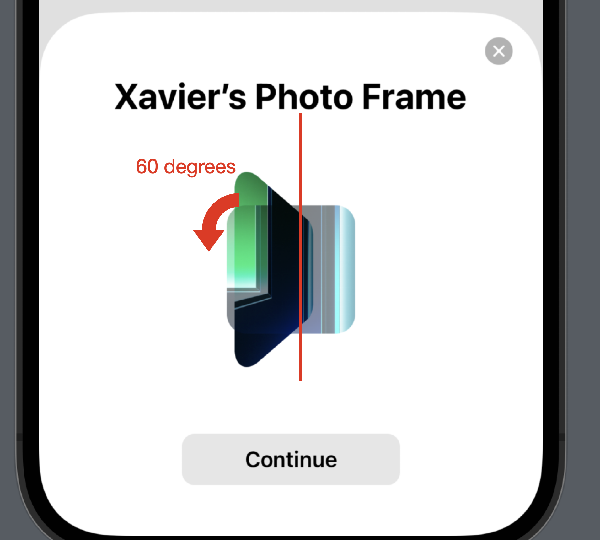
The preview canvas should look like the screenshot below.
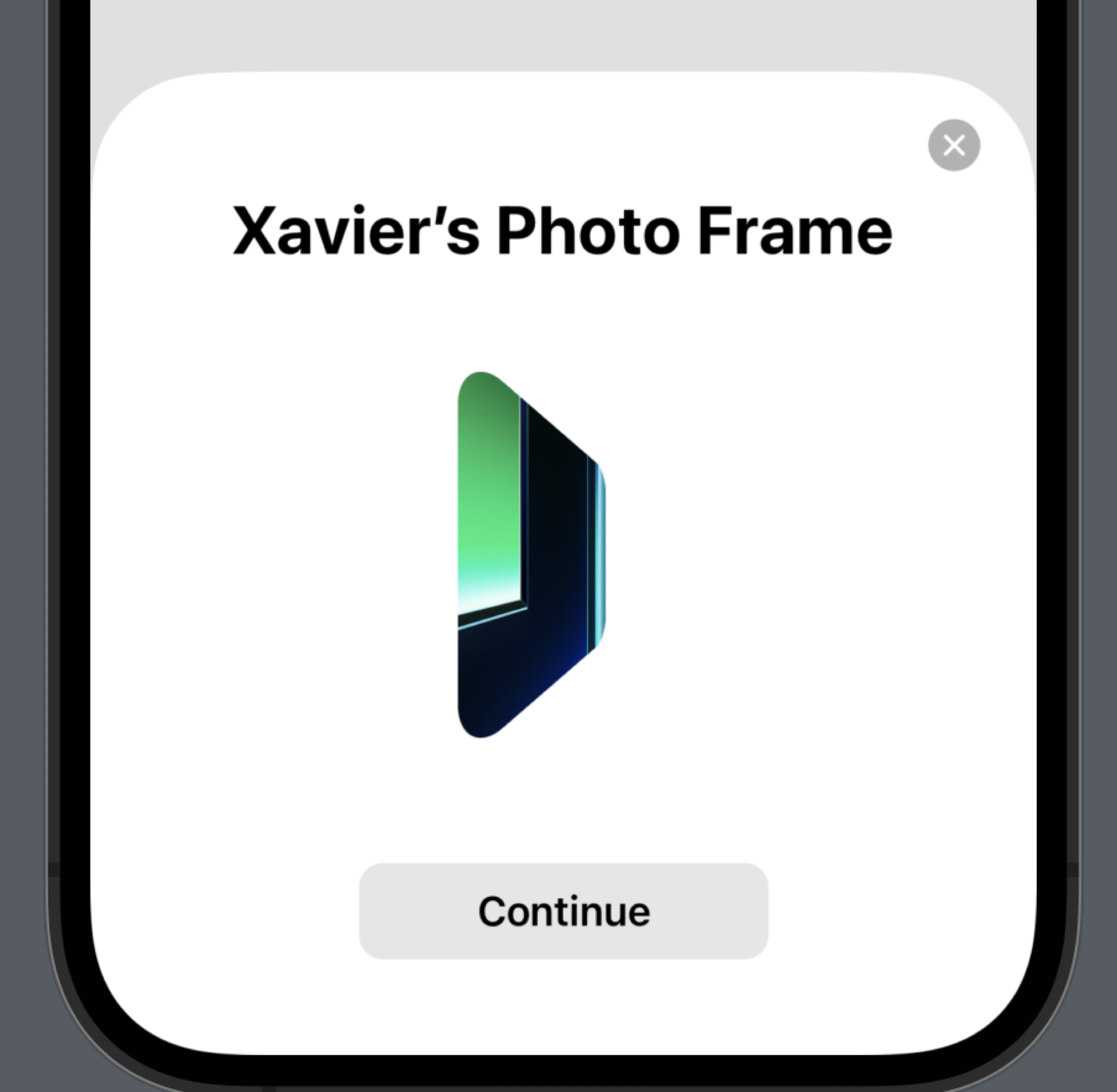
You can tell from the version below that this image rotates horizontally (centered the y-axis) for 60 degrees.
And then we need to make an animation and make the degree dynamic.
So create another state property for the degree, since we need it to change.
@State private var rotationDegree: Double = 0
And in the modifier of rotation3DEffect, use rotationDegree as the value of .degree() instead of 60 we hard coded before.
.rotation3DEffect(.degrees(rotationDegree), axis: (x: 0, y: 1, z: 0))
Now how can we toggle the animation?
Actually, we don’t necessarily have to toggle it, instead, we can increase the degree and put the code to increase rotationDegree inside a withAnimation closure when the image appears.
So when the image appears, the rotationDegree will gradually increase 360 degrees in 18 seconds of linear animation, and we can make the animation running non-stoppingly with the function .repeatForever().
Image("demo")
//...
//...
.rotation3DEffect(.degrees(rotationDegree), axis: (x: 0, y: 1, z: 0))
.onAppear {
    withAnimation(.linear(duration: 18).repeatForever(autoreverses: false)) {
        rotationDegree += 360
    }
}
And that’s everything of today’s tutorial. I hope you learned something and will be able to create animations with 3D effects and customized sheet presentations.
If you find this post helpful, please hit the like button or leave a comment. Also remember to subscribe to my newsletter if you’d like to receive more posts like this via email.
I’ll see you all in the next post!