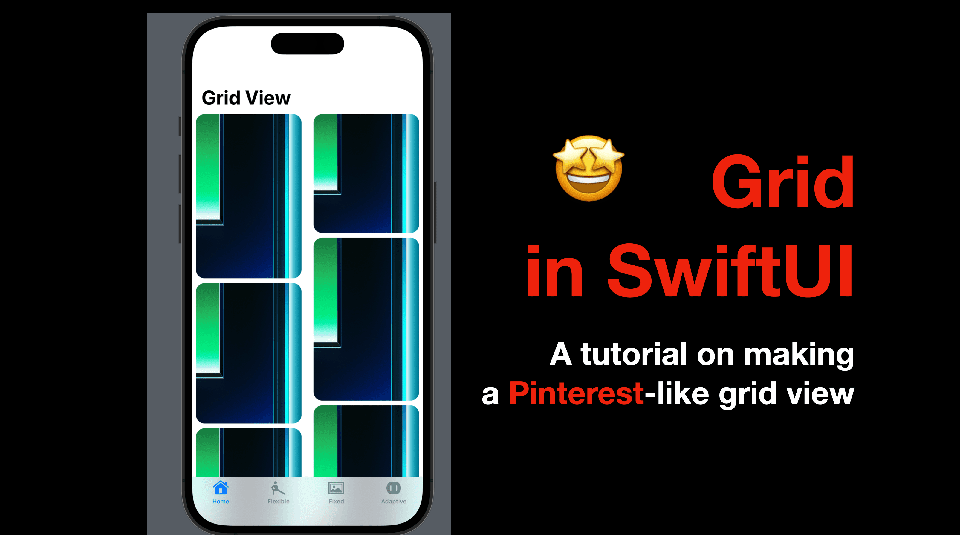
Hi all! In today’s post, I’d like to talk about Grid in SwiftUI. The contents start with an introduction of Grid, including GridItem, followed by a quick tutorial on making a grid view alike Pinterest’s home page. If you’re already familiar with the concepts regarding Grid, feel free to jump to Part 2 where we get into practice.
The code of this post is available here.
Part 1 - Intro to Grid and Grid Item
In SwiftUI, using ScrollView together with ForEach made things much easier while creating a list of data following the same UI format pattern, and they’re considered the alternative to the table view and collection view in UIKit. However, sometimes the patterns can be similar to each other, with differences though. In such a case, with only ForEach might be less handy.
Grid is a solution to this issue and as a SwiftUI view, we can easily use it with declarative syntax. Let’s get started to learn how.
Types of Grid View
Grid - a SwiftUI view with init parameters of horizontal and vertical spacings, and a content body where GridRows are defined.
LazyVGrid & LazyHGrid- the concept of Lazy was introduced in the post of LazyVStack and LazyHStack. It basically initializes elements inside of it on the user scrolls until near the element, hence saving spaces in memory and faster loading speed.
Lazy grids require a list of GridItem, to determine the size of the dimension of each cell. Grid items define the width of columns in a LazyVStack, or the height of rows in a LazyHStack.
There’re three ways to initialize a grid item:
fixed(CGFloat) - fixed width/height for the cell
flexible(min: CGFloat, max: CGFloat) - the cell will size according to the context. The default values of
minandmaxand0and.infinityrespectively.adaptive(min: CGFloat, max: CGFloat) - the mix of fixed and flexible: the cell will size according to the context, but won’t restricted by the rules set by
minandmax. The default values ofminandmaxand0and.infinityrespectively.
Now let’s code some SwiftUI views to see how they work.
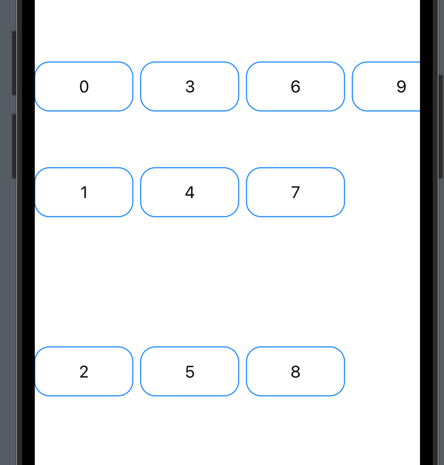
Fixed Grid Item
Let’s create a LazyHGrid that can be scrolled horizontally.
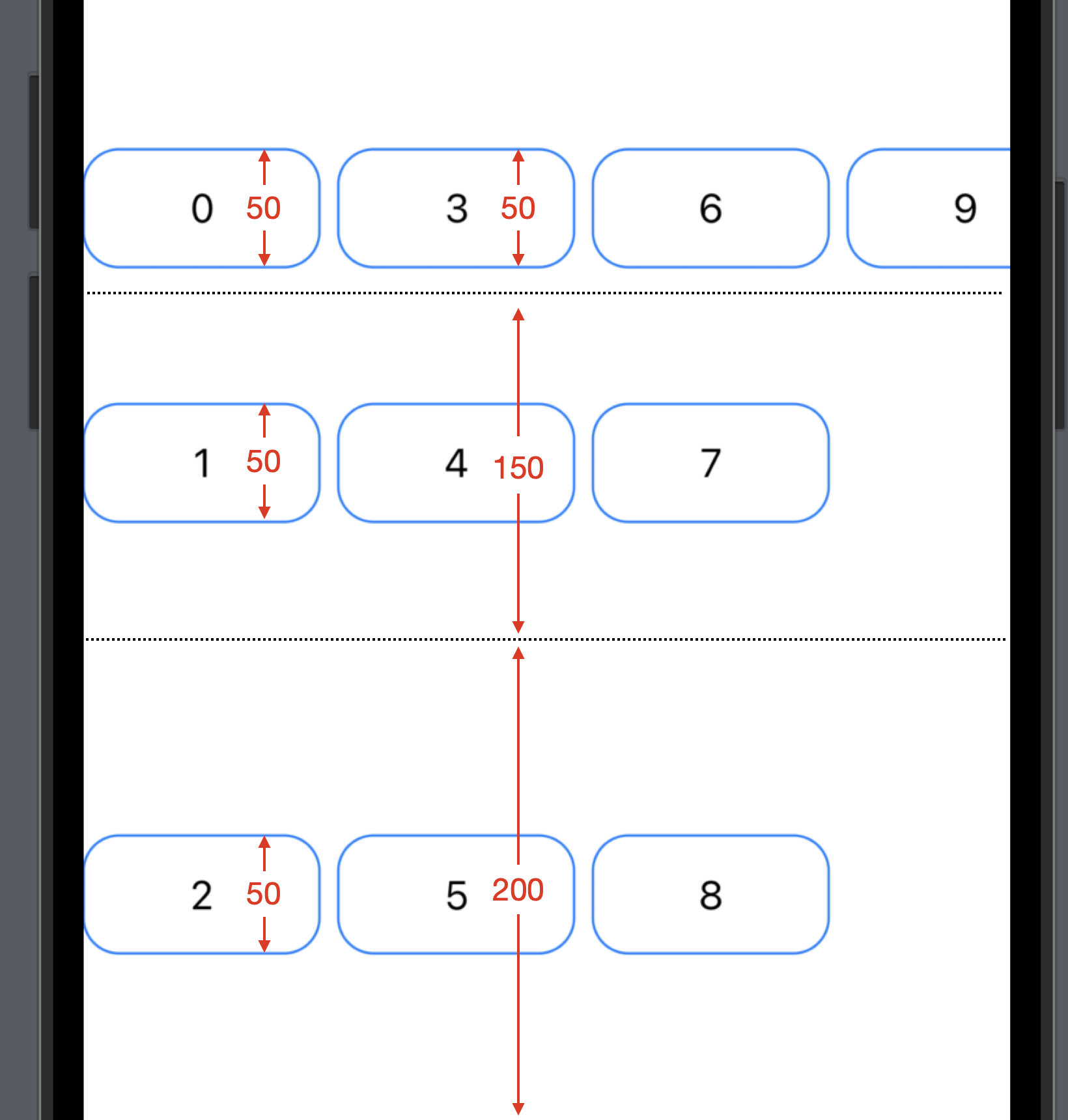
First, define an array of grid items. Use .fixed in the initializer and pass 50, 150 and 200. As mentioned above, the value defined here will determine the HEIGHT of the cells in the grid.
    private var fixedGridItems: [GridItem] = [
        .init(.fixed(50)),
        .init(.fixed(150)),
        .init(.fixed(200))
    ]
Now in the view body, create a horizontal scroll view, with a LazyHGrid inside and pass the fixedGridItems to it. Then in the grid, add a list of 10 items. Each item is a rounded rectangle with a text view of the index number above it.
ScrollView(.horizontal) {
    LazyHGrid(rows: fixedGridItems) {
        ForEach(0...9, id: \.self) { item in
            ZStack {
                RoundedRectangle(cornerRadius: 15)
                    .stroke()
                    .frame(width: 100, height: 150)
                    .foregroundColor(.accentColor)
                Text("\(item)")
            }
        }
    }
}
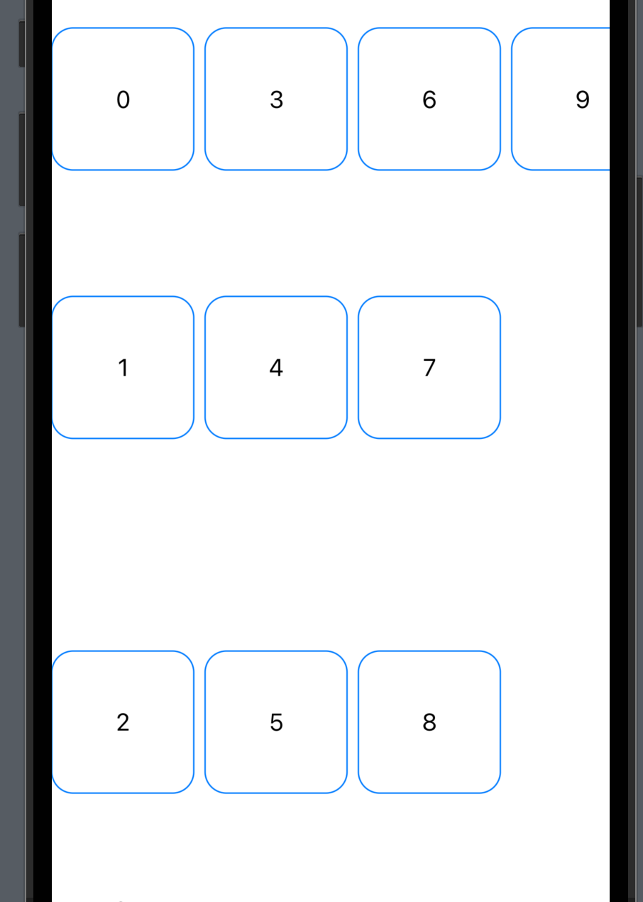
You should be able to see a horizontal scroll view like the screenshot below.
In our code, we defined the height of the rounded rectangles as 50, so they all look the same, however, in the grid item, the grid height values are 50, 150 and 200, so these 10 items are taking up different height, as shown in the notations below.
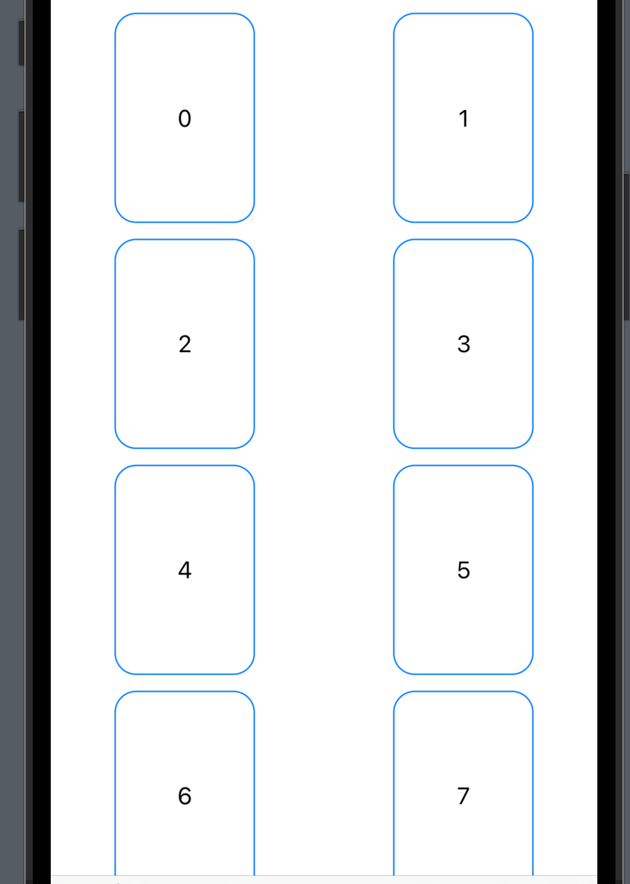
Flexible Grid Items
Now let’s take a look at the flexible grid items. This time, include two items in the array only, with the .flexible() initializer.
    private var flexibleGridItems: [GridItem] = [
        .init(.flexible()),
        .init(.flexible())
    ]
And then, define a vertical scroll view, with a LazyVGrid in it. Again, each cell will have a rounded rectangle, with a width of 100.
ScrollView(.vertical) {
    LazyVGrid(columns: flexibleGridItems) {
        ForEach(0...9, id: \.self) { item in
            ZStack {
                RoundedRectangle(cornerRadius: 15)
                    .stroke()
                    .frame(width: 100, height: 150)
                    .foregroundColor(.accentColor)
                Text("\(item)")
            }
        }
    }
}
My simulator iPhone is an iPhone 14 Pro, the screen of which is wide enough to hold three rounded rectangles in a row. However, as we defined the grid columns with an array of two grid items, there will be only two columns and the width of each cell is wider than 100, adjusted according to the screen size.
Adaptive Grid Item
Now let’s try an array of adaptive grid items.
    private var adaptiveGridItems: [GridItem] = [
        .init(.adaptive(minimum: 100, maximum: 120)),
        .init(.adaptive(minimum: 150)),
        .init(.adaptive(minimum: 120))
    ]
LazyHGrid(rows: adaptiveGridItems) {
    ForEach(0...9, id: \.self) { item in
        ZStack {
            RoundedRectangle(cornerRadius: 15)
                .stroke()
                .frame(width: 100, height: 100)
                .foregroundColor(.accentColor)
            Text("\(item)")
        }
    }
}
This time the height of each cell/row is not fixed or as large as possible. According to the grid items’ definition, the height of the first row will be between 100 to 120 (when the screen height is sufficient, the max value of 120 will be effective), and the second row and the third row will have a height of at least 150 and 120 (the min value in the initializers of grid items), and might be higher if the screen height is sufficient.
Part 2 - Pinterest-like Grid View
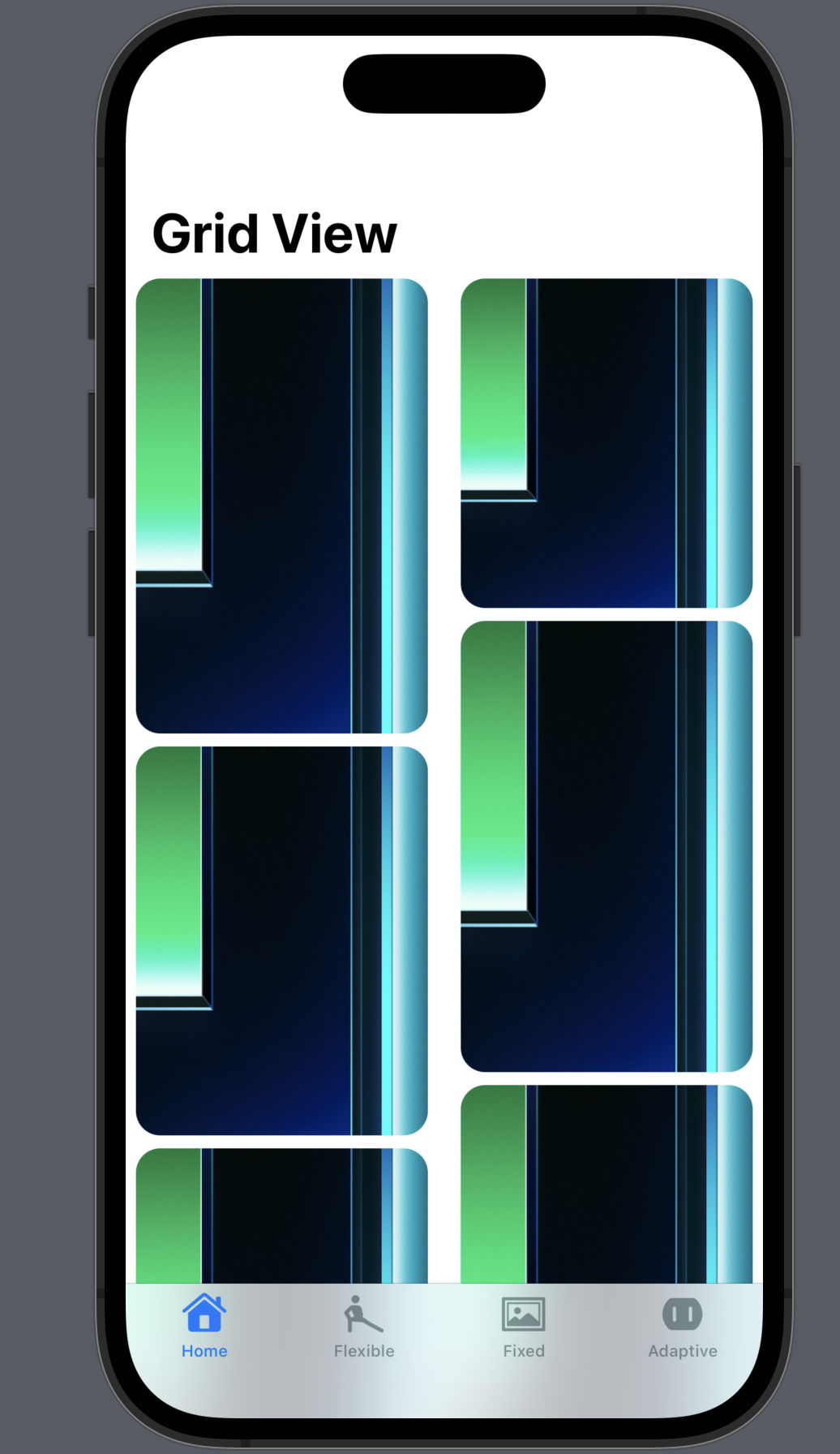
Now that we have learned how grid views work, let’s create the Pinterest-like grid view. A vertical scroll view with two grids, aligned to the top and it should be able to display images of any size.
Step 1 - Add an image to your project asset
Find an image and drag it the Assets.xcassets file in Xcode and then give it a name. For this demo, my image is named as "demo".
Step 2 - Create a list of images
Use ForEach to create a list of 50 images. You can use .resizable() and .frame() to control the size of the images. Here I’m using CGFloat.random to generate a random height, in order to simulate images with different height values.
Then add .clipped() and .clipShape after the resizable modifier, to make the image cropped and fit in the rounded rectangle shape.
private var imageList: some View {
    ForEach(0...49, id: \.self) { _ in
        Image("demo")
            .resizable()
            .clipped()
            .clipShape(RoundedRectangle(cornerRadius: 15))
            .frame(width: 180, height: CGFloat.random(in: 180...300), alignment: .center)
    }
}
Step 3 - Define the grid item
Define an array of grid items, with one item of fixed size or flexible size.
    private var homeGridItems: [GridItem] = [
        .init(.fixed(150))
    ]
// OR with a flexible grid item
    private var homeGridItems: [GridItem] = [
        .init(.flexible())
    ]
Step 4 - Define the scroll view
Since we need to make the grid aligned to the top, we can use two grids in an HStack with a .top alignment. Within the HStack, passing the grid item array homeGridItems as the columns and add the imageList defined in Step 1.
ScrollView {
    HStack(alignment: .top) {
        LazyVGrid(columns: homeGridItems) {
            imageList
        }
        LazyVGrid(columns: homeGridItems) {
            imageList
        }
    }
}
Optionally, you can wrap the scroll view inside a navigation stack or a navigation view and give it a title. And voila, the grid view is done!
That’s all of today’s content about grid views in SwiftUI. I hope this post helps and leave a comment or hit the like button if it does. If you’d like to receive the email version of more posts like this, subscribe to my newsletter.
I’ll see you all in the next post.