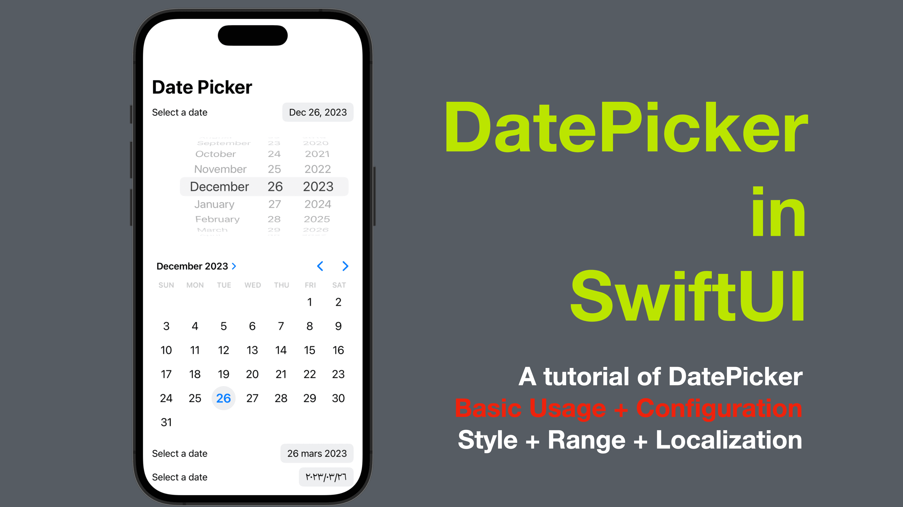
Date Picker in SwiftUI
A tutorial of DatePicker - Basic Usage + Configuration
The Date Picker is a common user interface element in iOS apps for selecting dates. SwiftUI provides the DatePicker view to make it easy to add a date picker to your app. In this blog post, we’ll go over how to use the Date Picker view in SwiftUI and how to customize its appearance.
The code of this post is available here.
Part 1: Basic Usage
To use the Date Picker in SwiftUI, you simply need to create an instance of the DatePicker view and provide a binding to a Date value. Here’s an example:
struct ContentView1: View {
@State private var selectedDate = Date()
var body: some View {
VStack {
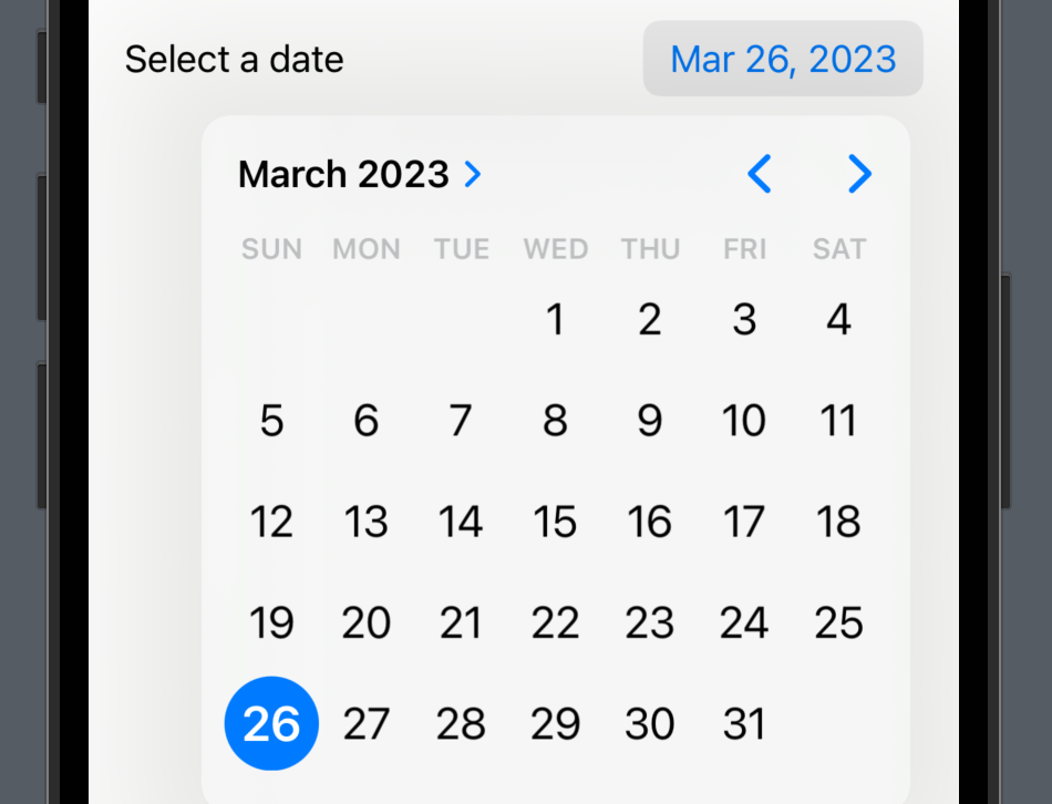
DatePicker("Select a date", selection: $selectedDate, displayedComponents: .date)
Text("Selected date: \(selectedDate.formatted(date: .abbreviated, time: .omitted))")
}
}
}
In this example, we create a Date Picker that displays the date components (day, month, and year) and binds to the selectedDate state variable using the $ syntax. We also include a Text view that displays the selected date using a DateFormatter instance.
The displayedComponents parameter is used to control which components of the date should be displayed in the date picker. In this example, we set it to .date to display the day, month, and year.
The first screenshot below shows the date picker preview and the text representing the date selected and the second screenshot is the picker content where the date options are nested.

Part 2: Configuration
The Date Picker view in SwiftUI is highly customizable, and there are a number of properties that you can use to change its appearance and behavior. Here are some examples:
2-1: Date Range
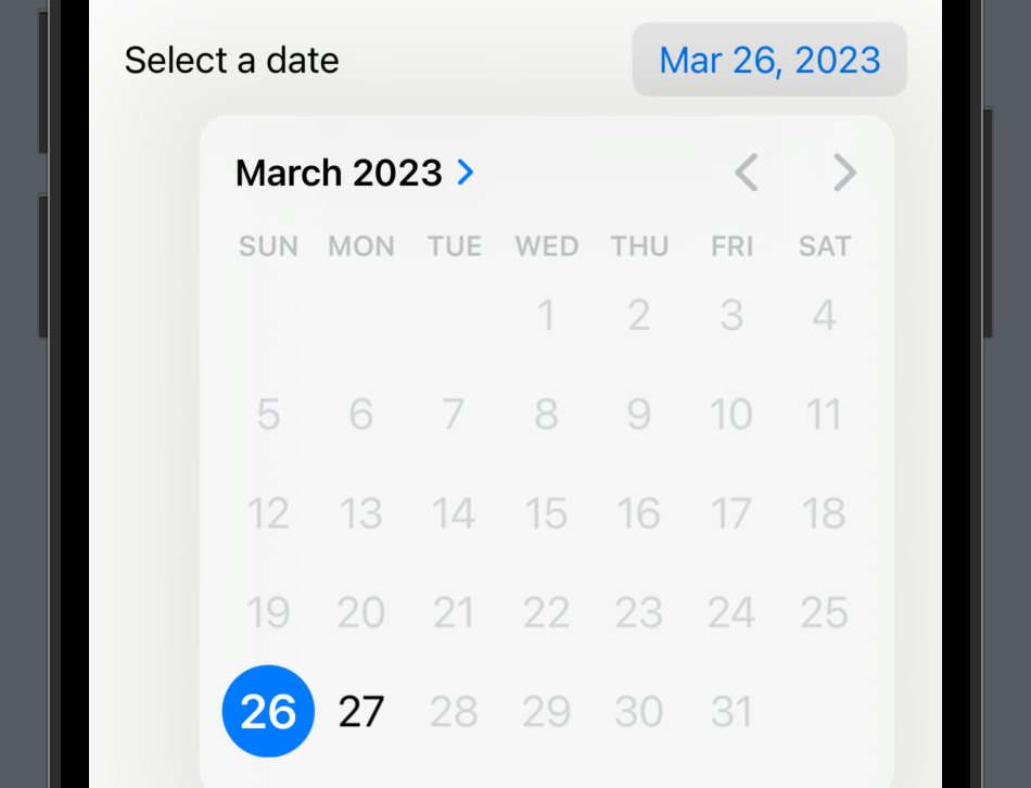
You can set a minimum and maximum date range for the Date Picker by using the minimumDate and maximumDate parameters. For example:
    struct ContentView2: View {
        @State private var selectedDate = Date()

        var body: some View {
            VStack {
                DatePicker("Select a date", selection: $selectedDate, in: Date()...Date().addingTimeInterval(86400), displayedComponents: .date)
                Text("Selected date: \(selectedDate.formatted(date: .abbreviated, time: .omitted))")
            }
        }
    }
In this example, we set the minimum date to the current date and the maximum date to 24 hours later using Date().addingTimeInterval(86400). (86400 secs = 24h x 60min x 60secs).
Now the available options inside the picker will be the current date and the next date only.
2-2: Date Picker Style
You can choose from a number of different styles for the Date Picker by using the datePickerStyle modifier. Here are a few examples:
struct ContentView3: View {
@State private var selectedDate = Date()
var body: some View {
VStack {
DatePicker("Select a date", selection: $selectedDate, displayedComponents: .date)
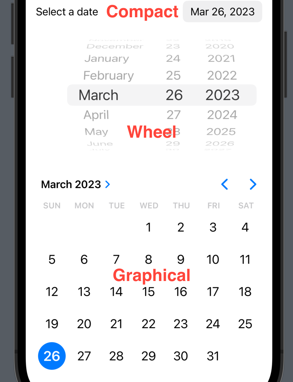
.datePickerStyle(.compact)
DatePicker("", selection: $selectedDate, displayedComponents: .date)
.datePickerStyle(.wheel)
DatePicker("Select a date", selection: $selectedDate, displayedComponents: .date)
.datePickerStyle(.graphical)
}
}
}
In this example, we use the .compact, .wheel, and .graphical to change the appearance of the Date Picker. You can tell from the preview or the screenshot below that
The
compactstyle is the default style where no style modifier is applied. With this style, a short date will be presented, on tap of which the view will display a menu for selection.the
wheelstyle contains several scrolls for the users to pick the value for each date component.the
graphicalstyle presents the calendar-like view directly in the root view, so that the users don’t have to toggle it and can select a date directly from the "calendar view".
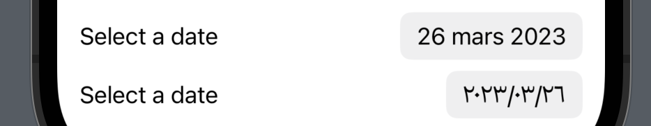
2-3: Localization
You can also specify the locale for the Date Picker by using the environment modifier with the locale keypath. For example:
    struct ContentView4: View {
        @State private var selectedDate = Date()
        var body: some View {
            VStack {
                DatePicker("Select a date", selection: $selectedDate, displayedComponents: .date)
                    .environment(\.locale, Locale.init(identifier: "fr_FR"))
                DatePicker("Select a date", selection: $selectedDate, displayedComponents: .date)
                    .environment(\.locale, Locale.init(identifier: "ar"))
            }
        }
    }
In this example, we set the locale to French and Arabic using the Locale initializer. For more about Locale and Localization, check out my previous post here.
Conclusion
In this post, we took a look at the DatePicker in SwiftUI and learned its basic usage of it, as well as the configurations such as style, localization and selection range for the date picker.
That’s all of today’s post. I hope it helps and let me know if it is by leaving a comment. Don’t forget to subscribe to my newsletter if you’d like to receive posts like this via email.
I’ll see you in the next post!