Create a Page View in SwiftUI
A tutorial on making a Welcome view with Page-Styled TabView
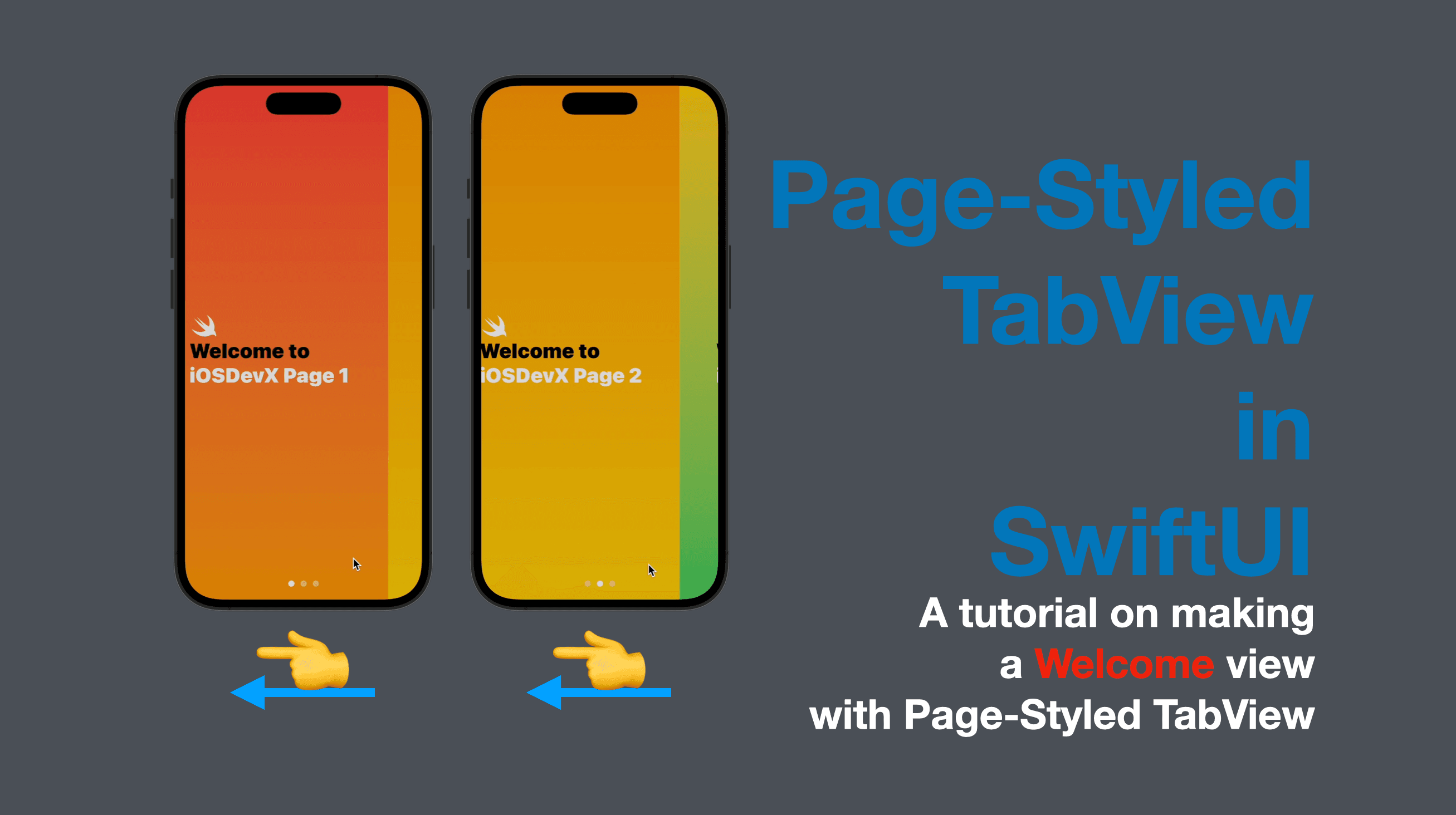
While making a mobile app, it’s common and of vital importance to include a "Welcome" section for the first launch of the app, where the functionalities and tips for usage can be introduced. In today’s tutorial, I’m going to demonstrate how to make a page-styled welcome view in SwiftUI (the result of which is similar to UIPageView in UIKit).
The code of this post is available here.
Introduction
Since there isn’t a SwiftUI alternative to the UIPageViewController in UIKit, we can create a TabView to realize the functionality of a "Page View". The standard tab view is also commonly used, but to make a page view, we need a view modifier called tabViewStyle, with a value of .page passed in. Continue reading to learn how.
Step 1: Define the content of the first pages
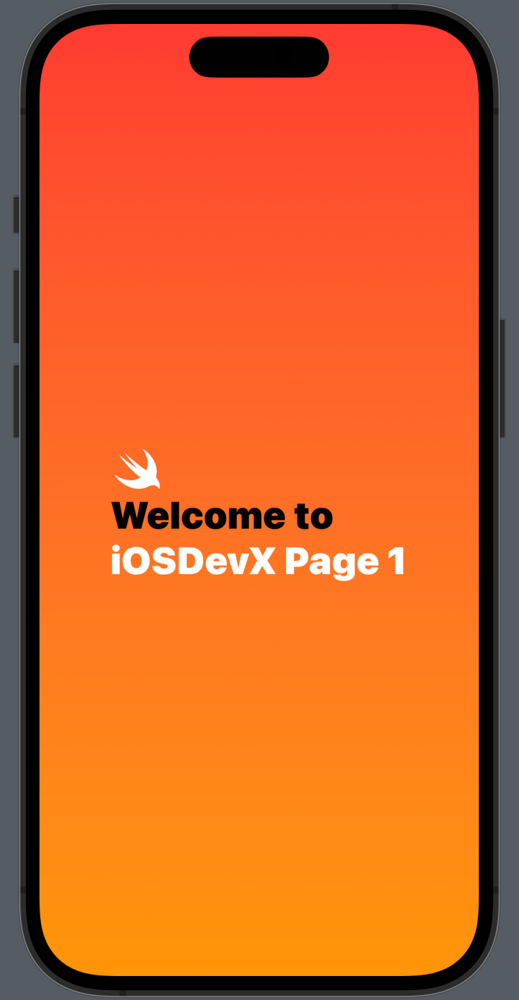
First of all, we need the views to be displayed on each page. So let’s create them, as private properties inside the content view.
struct ContentView: View {
    var body: some View {
        tab1
    }
    private var tab1: some View {
        ZStack {
            LinearGradient(colors: [.red, .orange], startPoint: .top, endPoint: .bottom)
                .ignoresSafeArea()
            VStack(alignment: .leading) {
                Image(systemName: "swift")
                Text("Welcome to")
                    .foregroundColor(.black)
                Text("iOSDevX Page 1")
            }
            .foregroundColor(.white)
            .font(.largeTitle)
            .fontWeight(.black)
        }
    }
}
The code above creates a private view property called tab1, which is our first page. It has a linear gradient background, (if you’re not familiar with Linear Gradient in SwiftUI, check out my previous post about it here), a VStack with an image and welcome texts, all put inside a ZStack.
In the body property, you can put tab1 inside to see the result in the preview canvas. The screenshot below shows what tab1 looks like.
Step 2: Create the views for the following pages
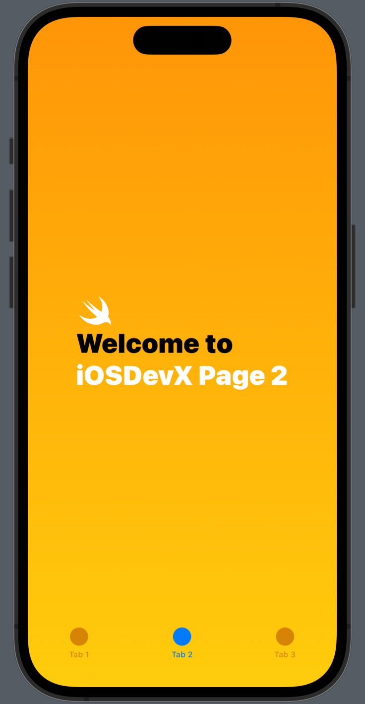
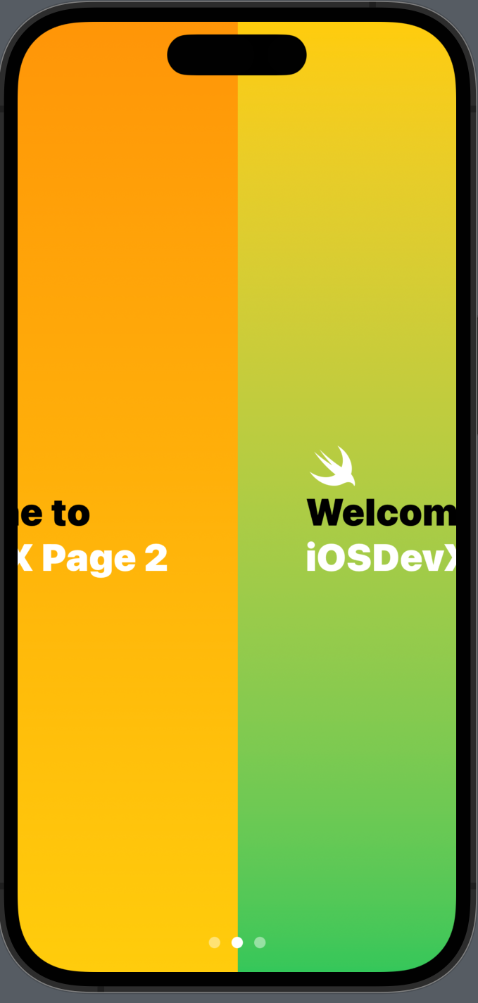
Similar to the first step, we can create another two private properties inside of the content view. This time we are using different colors inside the linear gradient background, and the text view "iOSDevX Page" is followed by the number 2 and then 3 to indicate the page number.
private var tab2: some View {
    ZStack {
        LinearGradient(colors: [.orange, .yellow], startPoint: .top, endPoint: .bottom)
            .ignoresSafeArea()
        VStack(alignment: .leading) {
            Image(systemName: "swift")
            Text("Welcome to")
                .foregroundColor(.black)
            Text("iOSDevX Page 2")
        }
        .foregroundColor(.white)
        .font(.largeTitle)
        .fontWeight(.black)
    }
}
private var tab3: some View {
    ZStack {
        LinearGradient(colors: [.yellow, .green], startPoint: .top, endPoint: .bottom)
            .ignoresSafeArea()
        VStack(alignment: .leading) {
            Image(systemName: "swift")
            Text("Welcome to")
                .foregroundColor(.black)
            Text("iOSDevX Page 3")
        }
        .foregroundColor(.white)
        .font(.largeTitle)
        .fontWeight(.black)
    }
}
Step 3: Define a tab view in the content view
Now let’s create the tab view with the pages we created in Step 1 and 2.
    var body: some View {
        TabView {
            tab1
                .tabItem {
                    Label("Tab 1", systemImage: "circle")
                }
            tab2
                .tabItem {
                    Label("Tab 2", systemImage: "circle")
                }
            tab3
                .tabItem {
                    Label("Tab 3", systemImage: "circle")
                }
        }
        .ignoresSafeArea()
    }
Inside the body property, replace tab1 with a TabView, and inside it, add tab1 , tab2 and tab3 we created in the previous two steps. For each of the tabs, a tabItem view modifier with a Label in it. To make the tab shown on the entire screen, add a view modifier .ignoresSafeArea(), so that the top and bottom edges be part of the background gradient color.
The preview canvas should be updated, and you can see a standard tab view with three circle icons at the bottom of the screen.
Step 4: Apply the view modifier to the TabView
The final step is to apply a view modifier called tabViewStyle to the TabView. And the value we need for this modifier is .page.
    var body: some View {
        TabView {
            tab1
                .tabItem {
                    Label("Tab 1", systemImage: "circle")
                }
            tab2
                .tabItem {
                    Label("Tab 2", systemImage: "circle")
                }
            tab3
                .tabItem {
                    Label("Tab 3", systemImage: "circle")
                }
        }
        // the tab view style modifier
        .tabViewStyle(.page)
        .ignoresSafeArea()
    }
And voila, our page view is done. You can see that the circle icons are much smaller and when you swipe the screen horizontally, you’re changing the pages. If you’d like to make the icon different, say you need a square instead of a circle, simply change the value of the label system image.
That’s all of today’s post. I hope it helps and let me know if it is by leaving a comment. Don’t forget to subscribe to my newsletter if you’d like to receive posts like this via email.
I’ll see you in the next post!