Stepper in SwiftUI
Stepper is a user interface control that allows the user to increment or decrement a numeric value by tapping on a plus or minus button. SwiftUI provides a built-in Stepper view that makes it easy to implement this feature in our app.
In this blog post, we will explore the SwiftUI Stepper view and learn how to use it in our app.
The code in this post is available here.
What is SwiftUI Stepper?
SwiftUI Stepper is a user interface control that allows the user to increment or decrement a numeric value by tapping on the plus or minus button. It provides an intuitive way to adjust a value, such as a quantity or a rating.
The Stepper view has two properties that we can use to configure it:
value: The current value of the Stepper.
step: The amount to increment or decrement the value by.
By default, the step value is 1, and the range of values is not limited. However, we can specify a minimum and maximum value for the Stepper.
Creating a Basic Stepper
To create a basic Stepper in SwiftUI, we need to initialize it with a value and a step. We can also add a label to the Stepper to provide context to the user.
Here's an example of how to create a simple Stepper view:
struct StepperView: View {
    @State private var quantity = 0

    var body: some View {
        Stepper("Quantity: \(quantity)", value: $quantity)
            .foregroundColor(.indigo)
            .bold()
            .padding(.horizontal)
    }
}

struct StepperView_Previews: PreviewProvider {
    static var previews: some View {
        StepperView()
    }
}
In this example, we are using the @State property wrapper to store the current value of the Stepper. We are also passing the $quantity binding to the value parameter of the Stepper view.
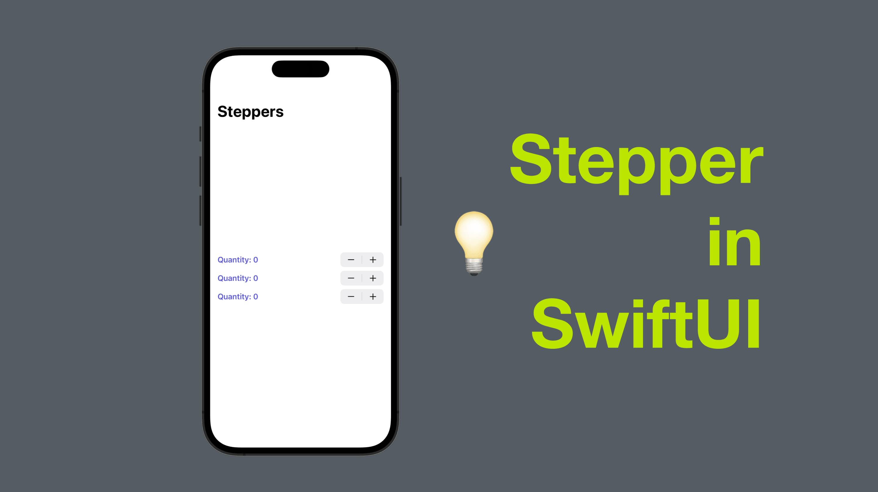
You should be able to see a stepper as shown in the screenshot below. When you tap the plus or minus button, the quantity text should get updated accordingly. You might also notice that we can also style the stepper text like other views, like the .foregroundColor, .bold and .padding view modifiers above.

Custom Step Value
Stepper in SwiftUI also supports a custom step value, instead of one (default). The step value is the amount of increment or reduction when you tap the plus or minus button.
To realize this, we need an extra parameter called step.
    struct StepperView2: View {
        @State private var quantity = 0
        var body: some View {
            Stepper("Quantity: \(quantity)", value: $quantity, step: 100)
                .foregroundColor(.indigo)
                .bold()
                .padding(.horizontal)
        }
    }
The code example above added the extra parameter step as mentioned above, and a value of 100 is passed. Hence every time the step button gets tapped, the amount will change in a unit of 100.

Handling Editing
Sometimes we need to monitor the stepper and check if the user is tapping on the button. To realize this, we can add another parameter while creating the step - onEditingChanged, which is a closure with a boolean parameter, indicating if the user is tapping on the plus or minus button. So let’s create another stepper with it.
    struct StepperView3: View {
        @State private var quantity = 0
        var body: some View {
            Stepper("Quantity: \(quantity)", value: $quantity, step: 100) { isEditing in
                print(isEditing)
            }
            .foregroundColor(.indigo)
            .bold()
            .padding(.horizontal)
        }
    }
This time we added the closure mentioned above. And every time the value of isEditing gets changed, the debug console will print out its value of true or false.
You should be able to see that when you tap one of the buttons of the stepper, the debug console will print true and then false. However, if you press the button and hold, only true gets printed and false won’t get printed until you release the cursor.