Progress View in SwiftUI
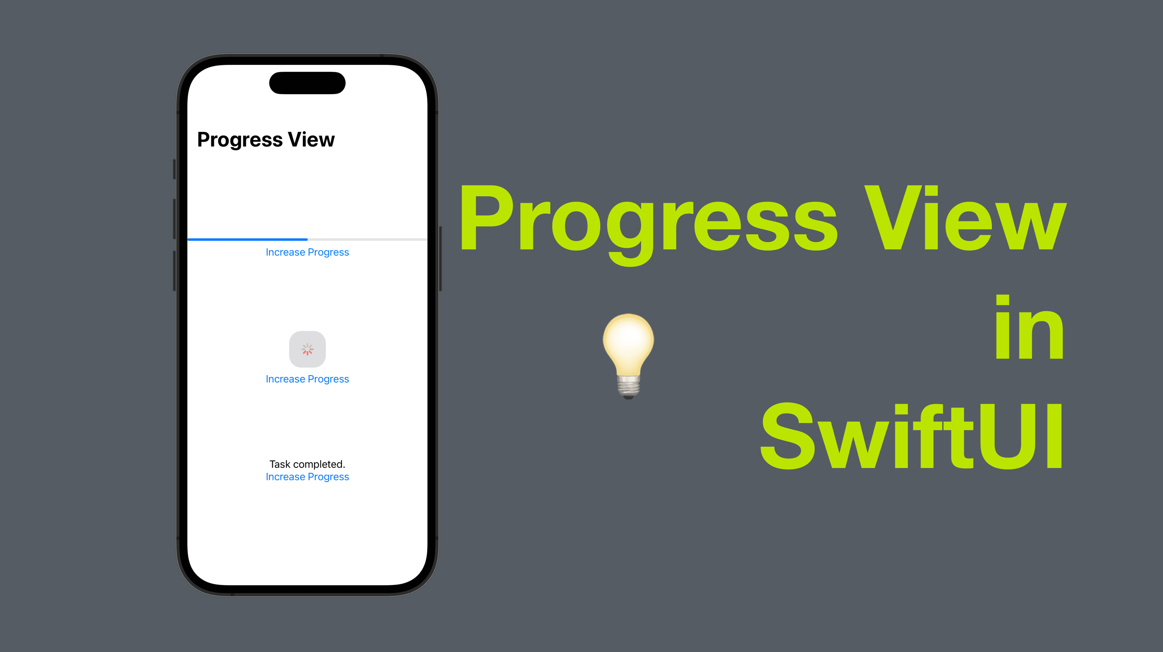
Progress views are a common UI element used to indicate the progress of a task or the completion percentage of an action. In SwiftUI, we can use the built-in ProgressView to add this functionality to our app.
In this blog post, we will explore how to use the ProgressView in SwiftUI.
The code of this post is available here.
1: Creating a basic progress view
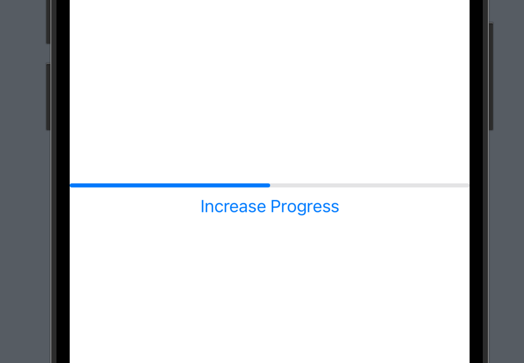
To create a basic progress view, we can simply use the ProgressView initializer with a @Binding variable that represents the progress value.
Here's an example:
struct ContentView1: View {
    @State private var progressValue = 0.5

    var body: some View {
        VStack {
            ProgressView(value: progressValue)
            Button("Increase Progress") {
                progressValue += 0.1
            }
        }
    }
}
In this example, we define a ContentView struct with a @State variable that represents the progress value. We then use the ProgressView initializer with a binding to the progress value, and a Button that increases the progress value by 0.1 when tapped.
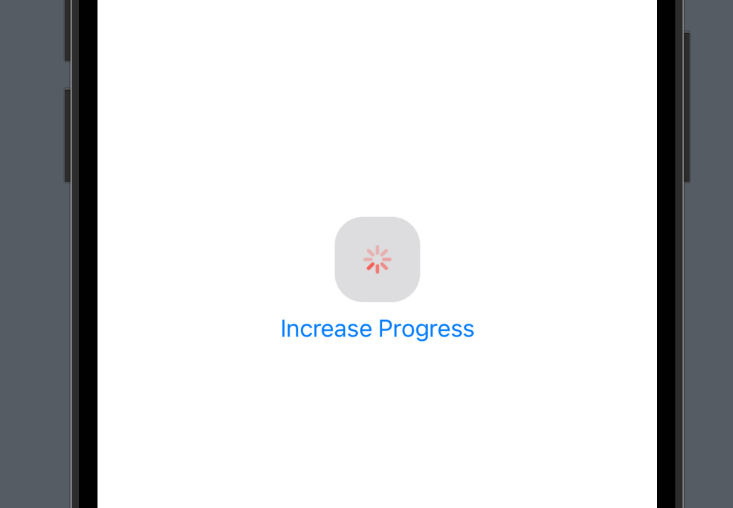
2: Customizing the progress view
The ProgressView has many customization options that allow us to change its appearance and behavior. For example, we can change the progress bar style, the progress tint color, and the progress track tint color.
Here's an example of customizing the ProgressView:
struct ContentView2: View {
    @State private var progressValue = 0.5

    var body: some View {
        VStack {
            ProgressView(value: progressValue)
                .progressViewStyle(CircularProgressViewStyle(tint: .red))
                .accentColor(.blue)
                .padding(20)
                .background(Color.gray.opacity(0.3))
                .cornerRadius(20)
            Button("Increase Progress") {
                progressValue += 0.1
            }
        }
    }
}
In this example, we use the CircularProgressViewStyle to change the progress bar style to a circular one, and set the tint color to red. We also use the accentColor modifier to change the color of the progress value, and add some padding, background color, and corner radius to the ProgressView.
3: Handling completion
In some cases, we may want to handle the completion of a progress view, such as showing a message or navigating to a new screen when a task is completed. In SwiftUI, we can use the onChange modifier to handle the completion of a progress view by checking the progress value.
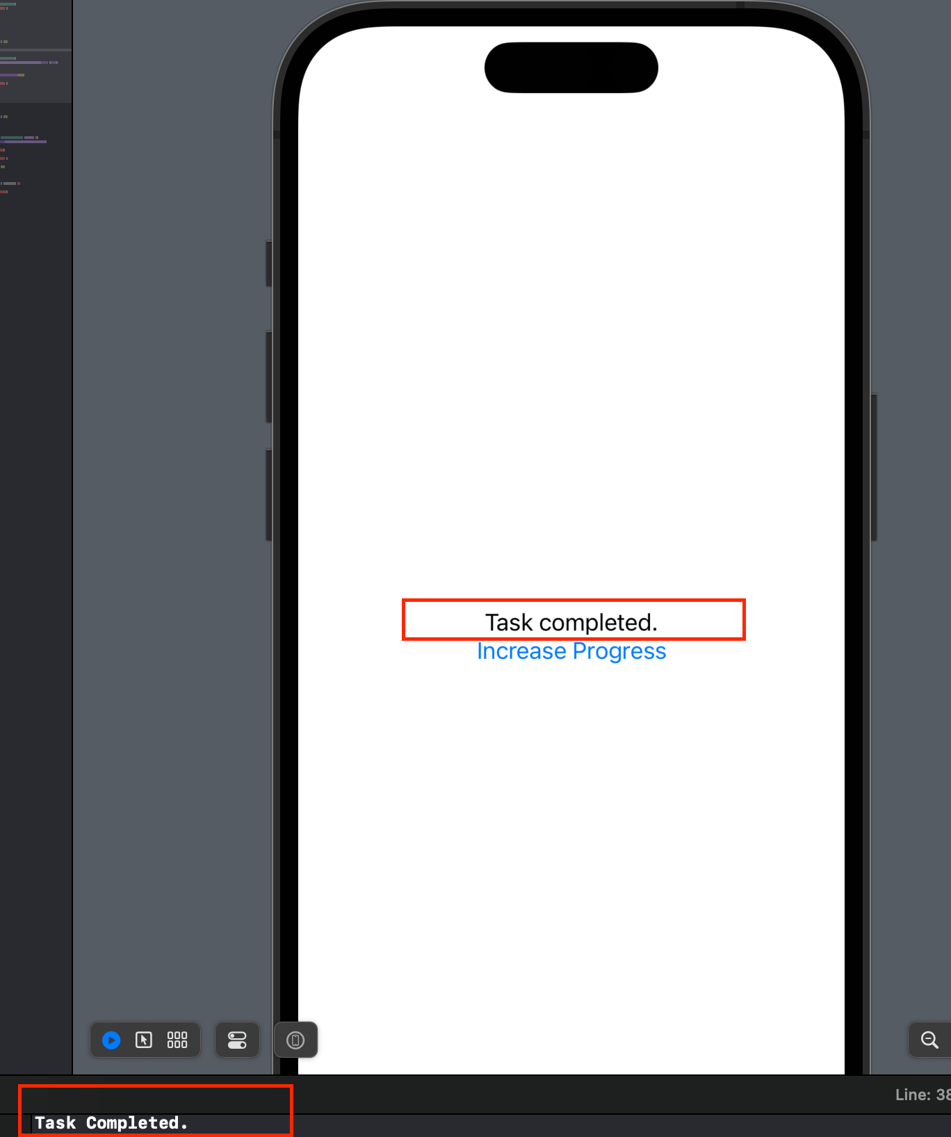
struct ContentView3: View {
    @State private var progressValue = 0.0

    var body: some View {
        VStack {
            if progressValue < 1.0 {
                ProgressView(value: progressValue, total: 1)
                    .progressViewStyle(LinearProgressViewStyle())
            } else {
                Text("Task completed.")
            }
            Button("Increase Progress") {
                withAnimation {
                    progressValue += 0.1
                }
            }
        }
        .onChange(of: progressValue) { newValue in
            if newValue >= 1.0 {
                print("Task Completed.")
            }
        }
    }
}
In this example, we use the total parameter to set the total value of the progress view to 1.0. We also use the LinearProgressViewStyle to change the progress bar style to a linear one, and the onChange modifier to print a message when the progress is completed and the progress value is greater than or equal to 1.0.
In conclusion, the ProgressView is a powerful UI element in SwiftUI that allows us to indicate the progress of a task or action. By using the customization options and the onChange modifier, we can create progress views that fit the style of our app and handle the completion of a task in a meaningful way.
That’s all of today’s post. I hope it helps and let me know if it is by leaving a comment. Don’t forget to subscribe to my newsletter if you’d like to receive posts like this via email.
I’ll see you in the next post!