Pickers in SwiftUI
Hi all, in today’s post, I’m going to demonstrate the Picker view in SwiftUI and the standard styles of this view.
The code in this post is available here.
Picker View and its initializer
In iOS 13, SwiftUI introduced the Picker view, which is a public struct and it allows the user to select a value from a provided list of values so that the data or UI can be updated accordingly.
To create a picker view, we can use the following initializer:
init(_ titleKey: LocalizedStringKey, selection: Binding<SelectionValue>, @ViewBuilder content: () -> Content)
The parameters are explained below:
titleKey: LocalizedStringKey. This is basically a string, however, the title won’t be displayed in all cases. (See later for more details.)
selection: Binding<SelectionValue>. The selection parameter expects a binding value, which holds a default value or a value that users have picked.
content - this is the view where users can pick a value. Often we can define a
ForEachto hold the values from an array, or all cases of an enumeration.
Now, let’s build a navigation view with different types of styled picker views.
Step 1 - Set up the Content View
The first step is to replace the default VStack in the Content View with a Navigation Stack or Navigation View that holds a List. Don’t add padding to the list or the formatting might be impacted.
struct ContentView: View {
    var body: some View {
        NavigationStack {
            List {
                //...More code will go here later
            }
            .navigationTitle("SwiftUI Pickers")
        }
    }
}
Step 2 - Add an Enum as the data source
Say we need a picker for users to select a direction to go forward, let’s create an enum of type String, with four cases - north, south, east and west. Since we’re going to use these cases in a ForEach for the picker, make sure the enum conforms to the protocol CaseIterable.
    enum Direction: String, CaseIterable {
        case north = "North"
        case south = "South"
        case east = "East"
        case west = "West"
    }
Step 3 - Create a Default Picker
As discussed in the initializer section, we need to pass a binding variable to hold the picked value, so let’s define a state property of Direction inside the view struct, and name it as pickedDirection.
struct ContentView: View {
    @State private var pickedDirection: Direction = .north
    var body: some View {
        //...
    }
}
And then, inside the list, let’s create a picker with its initializer of titleKey, selection and content.
The title key will be "Select a direction", and pass the binding value of pickedDirection (ie. $pickedDirection). And the content will be a ForEach.
List {
    Picker("Select a direction", selection: $pickedDirection) {
        ForEach(Direction.allCases, id: \.self) { direction in
            Text(direction.rawValue)
        }
    }
}
Note 1: The data we passed to the ForEach is from the Direction enum, since we made the enum conform to CaseIterable, we can all the method allCases to get all cases of the enum and iterate over them. Since the enum has a type of String, we can use direction.rawValue to get its string value instead of using its case name.
Note 2: The content closure of ForEach can be shortened to Text($0.rawValue) where $0 stands for the direction of each case. So you can use the code below if you prefer the shorthand syntax.
List {
    Picker("Select a direction", selection: $pickedDirection) {
        ForEach(Direction.allCases, id: \.self) {
            Text($0.rawValue)
        }
    }
}
Now you can see that the picker is working! When you pick a value from the menu list, the selected value in the list will get updated as well.
Step 4 - Make the Picker View Reuseable
Before we move on to figure out different types of picker view styles, let’s make the picker view a property in the content view, so that we don’t have to repeat the picker code.
To do this, create a new computed property of type some View, give it a name picker.
Cut the code of the picker from Step 3, and paste it inside the computed property. Now we can reuse it.
And put picker inside the list and bring it back to the content view.
var picker: some View {
    Picker("Select a direction", selection: $pickedDirection) {
        ForEach(Direction.allCases, id: \.self) { direction in
            Text(direction.rawValue)
        }
    }
}
var body: some View {
    NavigationStack {
        List {
            picker
        }
        .navigationTitle("SwiftUI Pickers")
    }
}
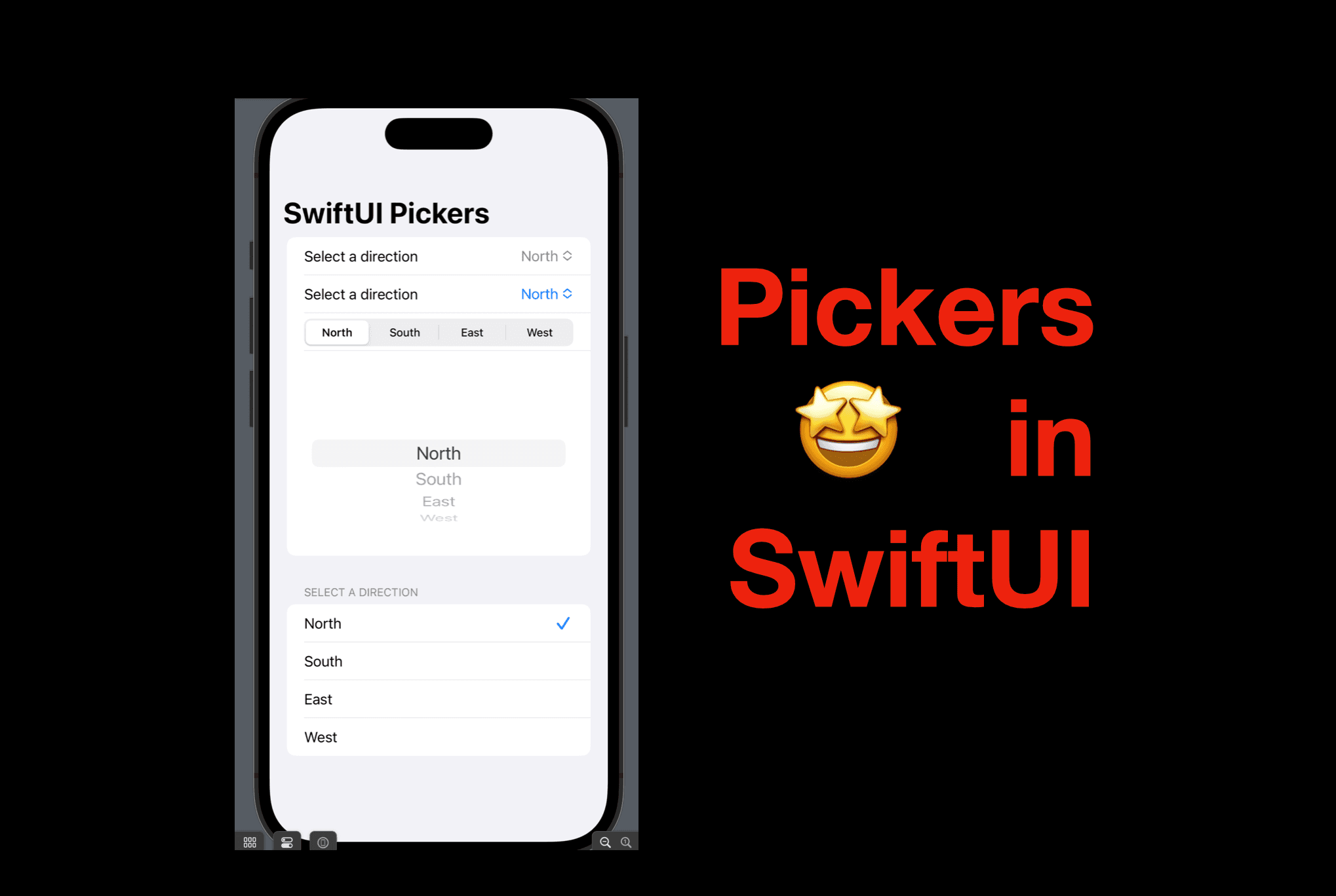
Step 5 - Picker Styles
Now let’s take a look a different picker styles. For each picker style, you can add the picker property with the style view modifier inside the list, below the first picker.
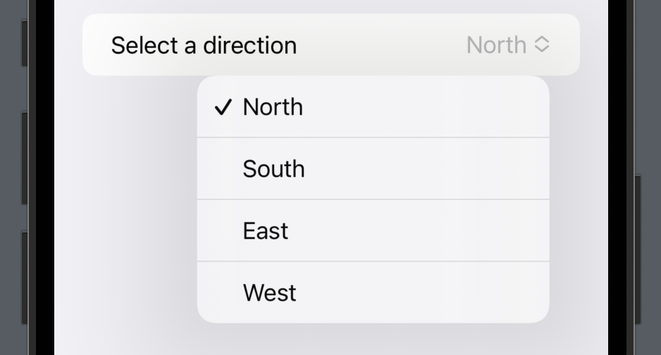
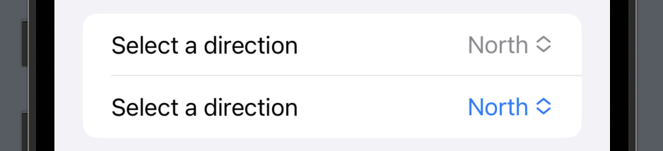
MenuPickerStyle
picker
    .pickerStyle(.menu)
This style looks almost the same as the default picker style. However, notice that the selected value will be shown in the system tint color if the picker style is set to .menu.
SegmentedPickerStyle
The segmented picker style will present a row with all the options. This might look cool, however, it is not a good choice for a long list of options, or the options have a long description.
picker
    .pickerStyle(.segmented)

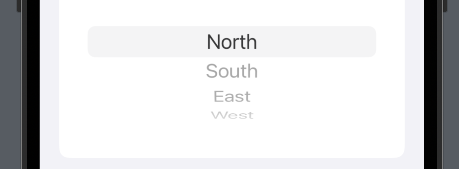
WheelPickerStyle
This is a commonly used picker, especially for options that can be shown in a temporarily presented view, like a sheet. And the users can scroll up and down, the value shown when the wheel stops will be picked automatically.
picker
    .pickerStyle(.wheel)
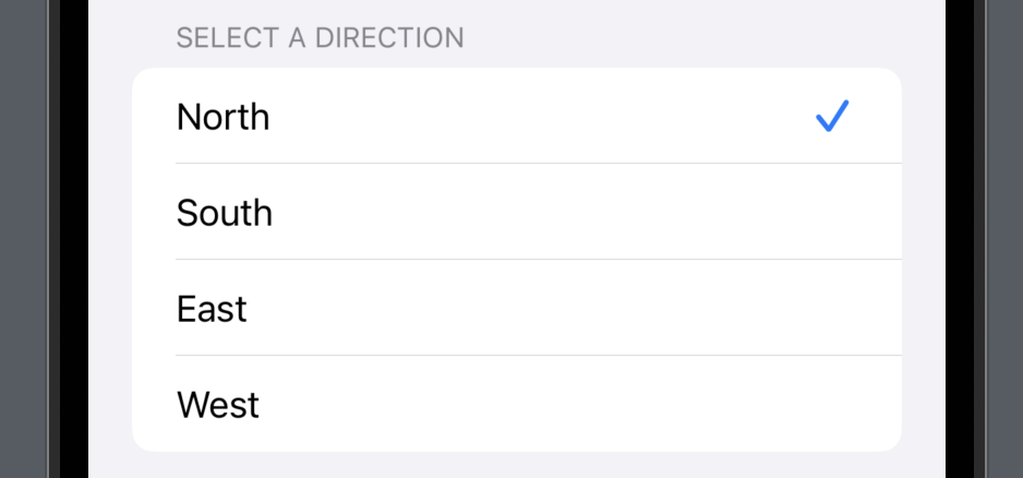
InlinePickerStyle
This style will show all the options available directly in the view so that we users don’t need to tap a button or a menu to expand the list - they can simply scroll up and down and tap a value. The selected value will be marked with a tint-colored checkmark in the row.
picker
    .pickerStyle(.inline)
And that’s all for today, I hope this post helped you understand how to create a picker view and the differences between the picker styles.
If you find it helpful, please hit the like button or subscribe to my newsletter. And I’ll see you all in the next post.