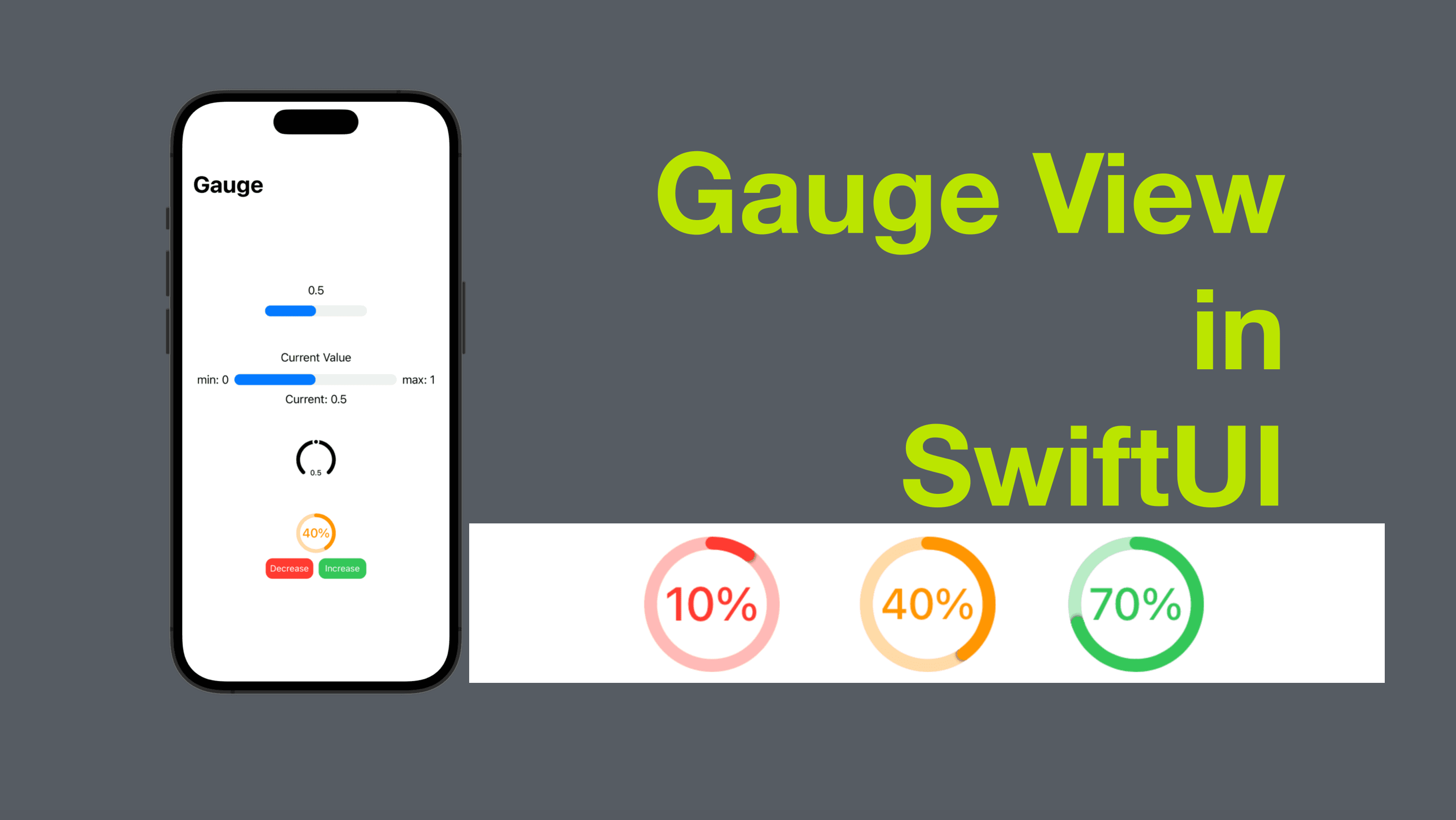
Gauge View in SwiftUI
Gauges are a useful way to represent data in a visual format. They are commonly used in applications that need to display data that changes over time, such as fitness or weather apps. In SwiftUI, creating a gauge is straightforward, and in this blog post, we'll take a look at how to do it.
The code of this post is available here.
Basic Gauge View
Gauge View was introduced in watchOS 7 and was only available on Apple Watches. Now SwiftUI introduced Gauge to iOS 16 and macOS 13. To create a basic gauge view, we need a value that conforms to BinaryFloatingPoint (typically a double value) and a label as the notation of the current value of the gauge.
Here's an example:
    struct ContentView1: View {
        @State private var currentValue = 0.5
        var body: some View {
            Gauge(value: currentValue) {
                Text(currentValue.formatted())
            }
            .frame(width: 150)
        }
    }
In this example, we define a ContentView1 struct with a @State double that represents the current value to be presented by the gauge view. We create the Guage with a binding to the current value, and a Text that displays the current value.

Gauge with More Details
There're some other parameters we can use to add more details to the Gauge, such as a label for min and max values.
Here's an example:
struct ContentView2: View {
@State private var currentValue = 0.5
var body: some View {
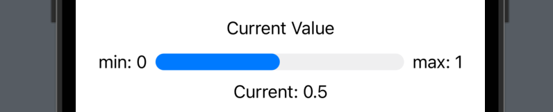
Gauge(value: currentValue, in: 0...1, label: {
Text("Current Value")
}, currentValueLabel: {
Text("Current: " + currentValue.formatted())
}, minimumValueLabel: {
Text("min: 0")
}, maximumValueLabel: {
Text("max: 1")
})
.frame(width: 350)
}
}
In the example above, we create a gauge similar to the first example. However, in this example, we added the values for some extra parameters:
label -> a view to display as the title of the gauge, ie. the text view of "Current Value" in this example
minimumValueLabel&maximumValueLabelas the annotation for the range of possible values of the gauge, ie. the texts "min: 0" and "max: 1" in this example.
Gauge Styles
To style gauge views, we can use the built-in view modifier called gaugeStyle.
For instance, for the gauge in the first example, we can use the following line to make it a circular gauge.
.gaugeStyle(.accessoryCircular)

All styles available are:
accessoryLinear

accessoryLinearCapacity

accessoryCircular

accessoryCircularCapacity

Tutorial - Making a Battery Level Gauge
Step 1: Create a @State Double
First of all, we need a state property to hold the battery level value.
@State private var batteryLevel: Double = 60
Step 2: Define the color rules
To make the color of the gauge change according to the battery level, let’s create a computed property of type color.
        var gaugeColor: Color {
            switch batteryLevel {
            case 50...100: return .green
            case 21...49: return .orange
            default: return .red
            }
        }
Inside the computed property, we use a switch statement to check the battery level - while its value is between 50 and 100, the color is .green and while its value is between 21 and 49, the color is .orange, otherwise the color is .red.
Step 3: Buttons to change the battery level
Let’s add two buttons, with the label "Decrease" and "Increase" respectively. And the action of the button is to decrease or increase the battery level by 10, conditionally, to make sure the battery level falls between 0 and 100.
                HStack {
                    Button {
                        if batteryLevel > 1 {
                            batteryLevel -= 10
                        }
                    } label: {
                        Text("Decrease")
                            .font(.footnote)
                            .foregroundColor(.white)
                            .frame(width: 70, height: 30, alignment: .center)
                            .background(Color.red.cornerRadius(10))

                    }
                    Button {
                        if batteryLevel < 99 {
                            batteryLevel += 10
                        }
                    } label: {
                        Text("Increase")
                            .font(.footnote)
                            .foregroundColor(.white)
                            .frame(width: 70, height: 30, alignment: .center)
                            .background(Color.green.cornerRadius(10))

                    }
                }
Step 4: Define the Gauge
Now we can create a Gauge with the batteryLevel as its value, 0...100 as its range, the battery level with a percentage sign "%" as its label.
To style the gauge, we can:
add a
foregroundColorto the label text, and use thegaugeColorwe defined in Step 2.add a
tintto the gauge view, and use thegaugeColordefined in Step2.add a
gaugeStyleview modifier and pass the value.accessoryCircularCapacityto make it a circular gauge, the ring of which will be closed if the battery level is 100%.
                Gauge(value: batteryLevel, in: 0...100) {
                    Text(batteryLevel.formatted() + "%")
                        .foregroundColor(gaugeColor)
                }
                .gaugeStyle(.accessoryCircularCapacity)
                .tint(gaugeColor)
And that’s it, you can see the gauge view as shown in the screenshot below. As when you tap the decrease button, you can see the battery level text and gauge view’s value and color getting updated accordingly.


That’s all of today’s post. I hope it helps and let me know if it is by leaving a comment. Don’t forget to subscribe to my newsletter if you’d like to receive posts like this via email.
I’ll see you in the next post!