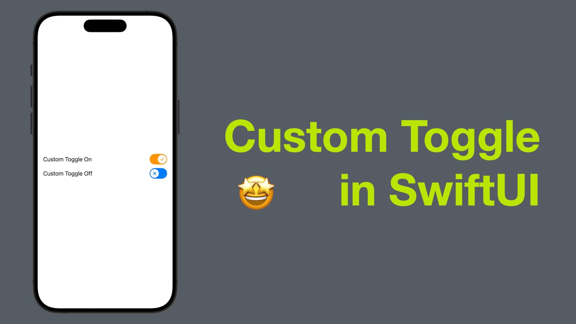
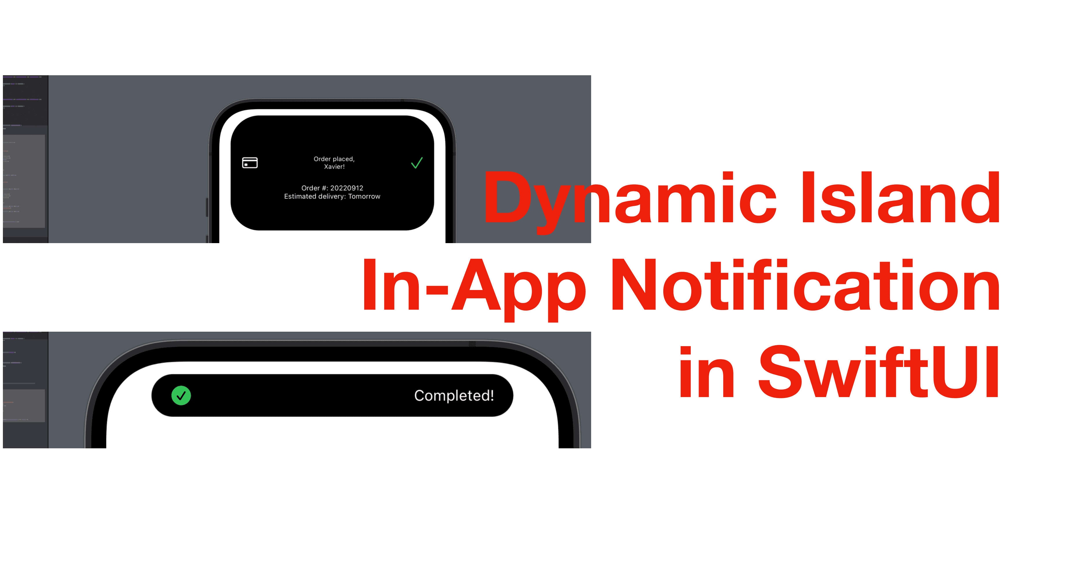
Dynamic Island In-App Notification in SwiftUI
Hey everyone, in today’s post, I’m going to show you how to toggle an in-app notification that displays a dynamic island capsule/rounded rectangle! If you’re interested, continue reading.
The source code of this post is available here. (Side note: moving forward, the source code of the posts or demos will be in one project instead of individual projects. I’ll mention the directory to go for the code in each post.)
Step 1 - Add state properties and buttons
We’ll look at two types of dynamic notifications today, so let’s start by creating two buttons to toggle the notifications. Before that though, we still need two @State property to tell if the buttons are tapped.
Note: Add the spacer as shown below to make the buttons vertically aligned. Also, the capsule view we’re about to present has a y offset so make sure the spacers are correctly added.
struct ContentView: View {
    @State private var showType1: Bool = false
    @State private var showType2: Bool = false
    var body: some View {
        VStack {
            Spacer()
                .frame(height: 100)
            Button("Show Type 1", action: { showType1.toggle() })
            Spacer()
                .frame(height: 50)
            Button("Show Type 2", action: { showType2.toggle() })
            Spacer()
        }
    }
}
Step 2 - Create the capsule view
Now create a new view struct. This is the view that we’ll need to present in the main view.
Inside the struct, define a Binding boolean property, so that we can pass in the state property from the main view. And in the body property, add a Capsule, which is a SwiftUI shape, and give it a foreground color of primary to match the dynamic island.
Then the frame we need has a fixed height, which matches the dynamic island, and the width will be 70% of the screen width when the capsule view is showing, and shorter when it’s not presented.
struct CapsuleView: View {
    @Binding var isShowing: Bool
    var body: some View {
        Capsule()
            .foregroundColor(.red)
            .frame(width: isShowing ? 0.7 * UIScreen.main.bounds.width : 125, height: 37)
    }
}
Step 3 - Add the capsule view to the main view
Add the capsule view above the first spacer. If showType1 is true, it’s going to present CapsuleView.
ZStack {
    CapsuleView(isShowing: $showType1)
}
.offset(y: -48)

Step 4 - Add animation and auto dismiss
You might have noticed that, after tapping the button, the capsule view shows up but there’s no animation and won’t go away. Now, let’s work on that.
Go to the action for the first button. Change showType1.toggle() to the code below.
The first line below defines a Spring animation, and then it toggles showType1 with the animation. After the first toggle, the program will wait 2 seconds (implemented with the asyncAfter function in DispatchQueue) and then toggles showType1 again to make the capsule view dismiss itself.
// animation - appear
let animation = Animation.spring(response: 0.7, dampingFraction: 0.7, blendDuration: 2.1)
withAnimation(animation) {
    showType1.toggle()
}
// animation - dismiss
DispatchQueue.main.asyncAfter(deadline: .now() + 2, execute: {
    withAnimation(animation) {
        showType1.toggle()
    }
})
Now press the button "Show Type 1" in the preview, and you can see the capsule expanding and collapsing automatically with an animation!
Step 5 - Add content to the capsule view
Now that we have the animated capsule working, we can add the notification content in the capsule view, with a ZStack. Note that the frame modifier should go outside of the ZStack.
For example, I added an HStack above the capsule, with a checkmark icon and text to indicate a task is completed.
struct CapsuleView: View {
    @Binding var isShowing: Bool
    var body: some View {
        ZStack {
            Capsule()
                .foregroundColor(.primary)
            HStack {
                Image(systemName: "checkmark.circle.fill")
                    .foregroundColor(.green)
                    .frame(width: 20, height: 20)
                Spacer()
                Text("Completed!")
                    .foregroundColor(.white)
                    .font(.footnote)
            }
            .padding(.horizontal)
        }
        .frame(width: isShowing ? 0.8 * UIScreen.main.bounds.width : 125, height: 37)
    }
}

Step 6 - The second view - RoundedRectangle
See in our capsule, information that can be shown can be very limited. To contain more information, we can make the area larger, with a RoundedRectangle, another SwiftUI shape.
Create the second view called RoundedRectView, this time, we’ll make use a rounded rectangle, the cornerRadius and height of which are now conditional too.
struct CapsuleView2: View {
    @Binding var isShowing: Bool
    var body: some View {
        RoundedRectangle(cornerRadius: isShowing ? 50 : 25)
            .foregroundColor(.primary)
            .frame(
                width: isShowing ? 0.8 * UIScreen.main.bounds.width : 125,
                height: isShowing ? 200 : 37
            )
    }
}
Step 7 - Update the main view
Now let’s bring the second view into the main view by adding it to the ZStack and putting it below the capsule view. The argument isShowing should now be $showType2.
            ZStack {
                CapsuleView1(isShowing: $showType1)
                RoundedRectView(isShowing: $showType2)(isShowing: $showType2)
            }
And then copy the action part of the first button and paste it within the action of the second button. The second button is now:
Button("Show Type 2", action: {
    let animation = Animation.spring(response: 0.7, dampingFraction: 0.7, blendDuration: 2.1)
    withAnimation(animation) {
        showType2.toggle()
    }
    DispatchQueue.main.asyncAfter(deadline: .now() + 2, execute: {
        withAnimation(animation) {
            showType2.toggle()
        }
    })
})
Now when you tap the second button, you should be able to see this:

Step 8 - Final step: add notification contents
Again, we can use a ZStack to add notification content above the rounded rectangle.
For instance, the VStack I added is a notification with an order summary and a thank-you message to confirm a transaction is completed.
struct RoundedRectView: View {
    @Binding var isShowing: Bool
    var body: some View {
        ZStack {
            RoundedRectangle(cornerRadius: isShowing ? 50 : 25)
                .foregroundColor(.primary)
            VStack {
                Spacer()
                HStack {
                    Image(systemName: "creditcard")
                        .resizable()
                        .frame(
                            width: isShowing ? 27 : 10,
                            height: isShowing ? 19 : 10)
                        .foregroundColor(.white)
                        .padding(isShowing ? 20 : 5)

                    Spacer()

                    VStack {
                        Text("Order placed,")
                        Text("Xavier!")
                    }
                    .foregroundColor(isShowing ? .white : .clear)
                    .font(.caption2)

                    Spacer()
                    Image(systemName: "checkmark")
                        .resizable()
                        //.bold()

                        .foregroundColor(isShowing ? .green : .clear)

                        .frame(
                            width: isShowing ? 20 : 10,
                            height: isShowing ? 20 : 10)
                        .padding(isShowing ? 20 : 5)
                }
                if isShowing {
                    Text("Order #: 20220912")
                        .font(.caption)
                        .foregroundColor(isShowing ? .white : .clear)
                    Text("Estimated delivery: Tomorrow")
                        .font(.caption)
                        .foregroundColor(isShowing ? .white : .clear)
                }
                Spacer()
            }
            .frame(height: isShowing ? 200 : 37)
        }
        .frame(
            width: isShowing ? 0.9 * UIScreen.main.bounds.width : 125,
            height: isShowing ? 200 : 37
        )
    }
}

Well, that’s all of this post. I hope it’s helpful! The dynamic island can be really playable, and if you have some ideas, don’t hesitate to show them off in the comment section.
Remember to subscribe to my newsletter to get posts like this via email. I’ll see you all in the next post.