Custom View Modifiers in SwiftUI
Sometimes you might find it repeating while declaring similar elements with the same modifiers added to your views. Today we’re going to look at how to use custom view modifiers to tackle this.
The source code of this post is available here.
Overview
We’ll get started by creating a customized text view first, with multiple standard modifiers, after which we’ll create a view modifier to make it reusable and finally enhance the view modifier to make it more reusable and scalable.
Step 1 - Text as a button label
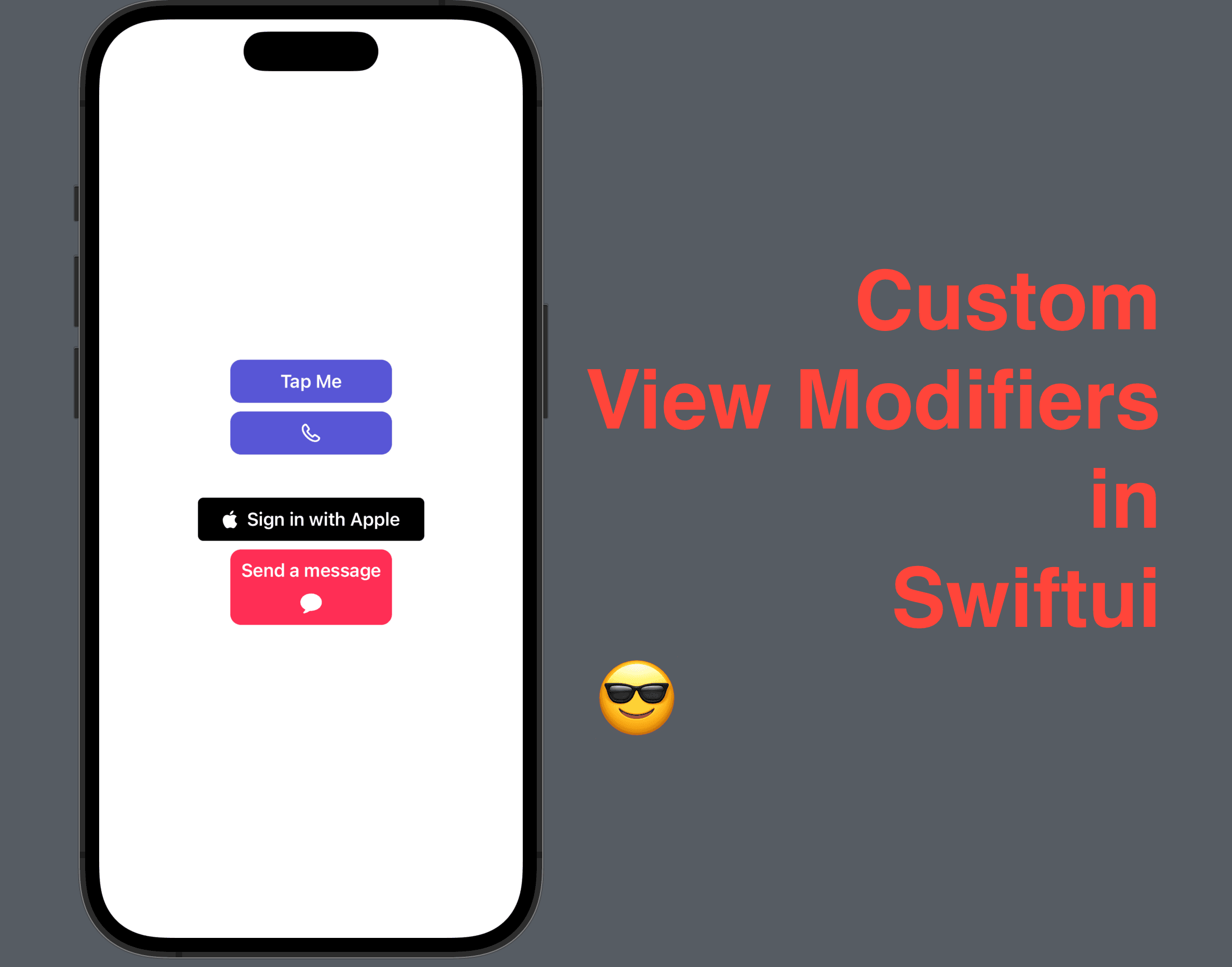
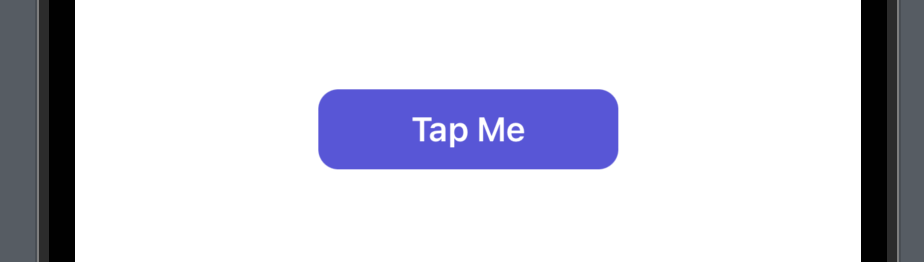
Let’s create a Text view and assume it’s going to be as a button label.
We added a bunch of modifiers to the text view.
bold() -> gives the text a bold font;
frame -> adds up a rectangle as its constraints;
background -> give the frame an indigo color fill;
cornerRadius -> made the background rectangle rounded;
foregroundColor -> made the text color white.
struct ContentView: View {
    var body: some View {
        VStack {
            Text("Tap Me")
                .bold()
                .frame(width: 150, height: 40)
                .background(.indigo)
                .cornerRadius(10)
                .foregroundColor(.white)
        }
        .padding()
    }
}
This is how the Text view looks like with these modifiers.
Step 2 - Create a view modifier
What if this style will be used throughout your project? You don’t want to write all these five modifiers every time you need a button label like this right?
So we can make a view modifier to address this issue. A View modifier is a protocol and the custom view modifiers conforming to it will have a body function that returns some View, which is the view as a result of the modifiers applied. And of course, we need to pass in a Content to the function, which is the source view that needs to be modified.
struct ButtonLabel: ViewModifier {
    func body(content: Content) -> some View {
        content
            // add all the modifiers from content view
            .bold()
            .frame(width: 150, height: 40)
            .background(.indigo)
            .cornerRadius(10)
            .foregroundColor(.white)
    }
}
Step 3 - Use the custom view modifier
Now let’s see how a custom view modifier can be used.
Let’s replace all the modifiers in Step 1 with just one modifier .modifier followed by a pair of brackets and the custom view model instance.
struct ContentView: View {
    var body: some View {
        VStack {
            Text("Tap Me")
                .modifier(ButtonLabel())
        }
        .padding()
    }
}
You can find that the result is exactly the same.

One thing that’s really cool about custom view modifiers is that: modifiers can work with different types of content.
Now let’s add an image with the same view modifier below the text view.
Image(systemName: "iphone")
    .modifier(ButtonLabel())
See that? The original image being rendered is just a small black icon. But with this modifier, we made it more suitable as a button label.

Step 4 - Properties in a View Modifier
Now you may be wondering: all sounds good but I want to use different background colors, different sizes, and different corner radiuses from these buttons, do I have to create a modifier for all of the variants I need?
The answer is YOU DONT.
The ButtonLabel view modifier is a struct, which means that we can define properties in it. So now let’s do that to make the view modifier more reusable.
Add width, height and cornerRadius properties with a type of CGFloat, then fgColor and bgColor as Color. Assign the properties a default value so that we can pass in the parameters only when needed.
struct ButtonLabel: ViewModifier {
    var width: CGFloat = 150
    var height: CGFloat = 40
    var cornerRadius: CGFloat = 10
    var fgColor: Color = .white
    var bgColor: Color = .indigo

    func body(content: Content) -> some View {
        content
            .bold()
            .frame(width: width, height: height)
            .background(bgColor)
            .cornerRadius(cornerRadius)
            .foregroundColor(fgColor)
    }
}
Step 5 - Another button label view
Now let’s try to use the new version of button label view modifier, by creating a button label for "Sign in with Apple" button.
As mentioned before, view modifiers can work with different types of content, not just texts. So we can have a HStack that contains an Apple logo image, and a text view of "Sign in with Apple".
And apply the modifier after the HStack, with the parameters customized, as shown below.
HStack {
    Image(systemName: "apple.logo")
    Text("Sign in with Apple")
}
.modifier(ButtonLabel(width: 210, height: 40, cornerRadius: 5, fgColor: .white, bgColor: .black))
You can see that the view modifier works with HStack perfectly.

Now let’s try another label - a "Send a message" button label in a VStack, with a text and the icon of an SMS message.
VStack {
    Text("Send a message")
    Spacer()
        .frame(height: 10)
    Image(systemName: "message.fill")
}
.modifier(ButtonLabel(width: 150, height: 70, cornerRadius: 10, fgColor: .white, bgColor: .pink))

Ok, that’s all about the intro to custom view modifiers. Hope this post helps and remember to subscribe to my newsletter to get more posts like this via email.
See you all in the next post!