3D Button in SwiftUI
Creating a 3D Button with Shadow and Linear Gradient in SwiftUI
Buttons are an essential part of any user interface, allowing users to interact with the app and trigger actions. In SwiftUI, it's easy to create buttons with a variety of styles and designs, including a 3D-style button that gives the impression of depth and dimension. In this blog post, we'll show you how to create a 3D-style button in SwiftUI.
The code in this post is available here.
Create the Button View
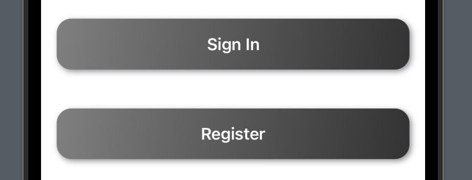
To create a 3D-style button, we'll start by creating a custom button view that includes a gradient background and a shadow effect. Here's the code to create the button view:
struct ThreeDButton: View {
    var text: String
    var action: () -> Void

    var body: some View {
        Button(action: action) {
            Text(text)
                .font(.headline)
                .foregroundColor(.white)
                .padding()
                .frame(minWidth: 0, maxWidth: .infinity)
                .background(
                    LinearGradient(
                        gradient: Gradient(
                            colors: [Color(red: 0.5, green: 0.5, blue: 0.5), Color(red: 0.2, green: 0.2, blue: 0.2)]
                        ),
                        startPoint: .topLeading,
                        endPoint: .bottomTrailing
                    )
                )
                .cornerRadius(10)
                .shadow(color: .gray, radius: 3, x: 2, y: 2)
        }
    }
}
In the above code, we define a ThreeDButton view that takes two parameters: the text to display on the button and the action to execute when the button is tapped.
Inside the Button view, we set the text, font, and color of the button. We then add padding to the text and set the minimum and maximum width of the button to be the full width of its parent view.
Next, we set the background of the button to a gradient that includes two colors: a lighter gray and a darker gray. We use the LinearGradient view to create the gradient and set the start and end points to create a diagonal gradient.
We then add a corner radius to the button to give it rounded edges and a shadow effect to create the 3D effect.
Use the Button View
Once we've created the ThreeDButton view, we can use it in our app like any other SwiftUI view. Here's an example of how to use the button view:
struct ContentView: View {
    var body: some View {
        VStack {
            ThreeDButton(text: "Sign In") {
                // perform sign-in action
            }
            .padding()
            ThreeDButton(text: "Register") {
                // perform registration action
            }
            .padding()
        }
    }
}
In the above code, we create a ContentView that contains two instances of the ThreeDButton view. We pass the text to display on the button and the action to execute when the button is tapped as parameters to the view.
We then add padding to the buttons to create some space between them.
Make the Button View More Reusable
We can make the button view more reusable by adding some properties inside the struct ThreeDButton .
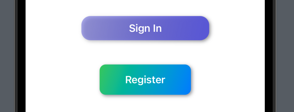
    var colors: [Color] = [.primary, .secondary]
    var width: CGFloat = .infinity
    var height: CGFloat = 50
    var cornerRadius: CGFloat = 15
In the code snippet above, we added four properties with default values to make the colors, width, height and button corner radius reusable.
Then we need to apply the properties in the body property of ThreeDButton.
struct ThreeDButton: View {
    var text: String
    var colors: [Color] = [.primary, .secondary]
    var width: CGFloat = .infinity
    var height: CGFloat = 50
    var cornerRadius: CGFloat = 15
    var action: () -> Void
    var body: some View {
        Button(action: action) {
            Text(text)
                .font(.headline)
                .foregroundColor(.white)
                .padding()
//                .frame(minWidth: 0, maxWidth: .infinity)
                .frame(width: width, height: height)
                .background(
                    LinearGradient(
                        gradient: Gradient(
                            //colors: [color.opacity(0.4), color.opacity(0.7), color]
                            colors: colors
                        ),
                        startPoint: .topLeading,
                        endPoint: .bottomTrailing
                    )
                )
//                .cornerRadius(15)
                .cornerRadius(cornerRadius)
                .shadow(color: .gray, radius: 3, x: 2, y: 2)
        }
    }
}
Now we can declare the 3D button with more custom values.
struct ContentView: View {
    var body: some View {
            VStack {

                ThreeDButton(text: "Sign In", colors: [.indigo.opacity(0.5), .indigo], width: 210, height: 40, cornerRadius: 15) {
                    // perform registration action
                }
                .padding()
                ThreeDButton(text: "Register", colors: [.green, .blue], width: 150, height: 50, cornerRadius: 10) {
                    // perform registration action
                }
                .padding()
            }
    }
}
Conclusion
In this blog post, we've shown you how to create a 3D-style button in SwiftUI. By creating a custom button view that includes a gradient background and a shadow effect, we can create a button that looks like it has depth and dimension. With the ability to customize the text and action of the button, we can create buttons that fit seamlessly into any app design.
That’s all of today’s post. I hope it helps and let me know if it is by leaving a comment. Don’t forget to subscribe to my newsletter if you’d like to receive posts like this via email.
I’ll see you in the next post!