

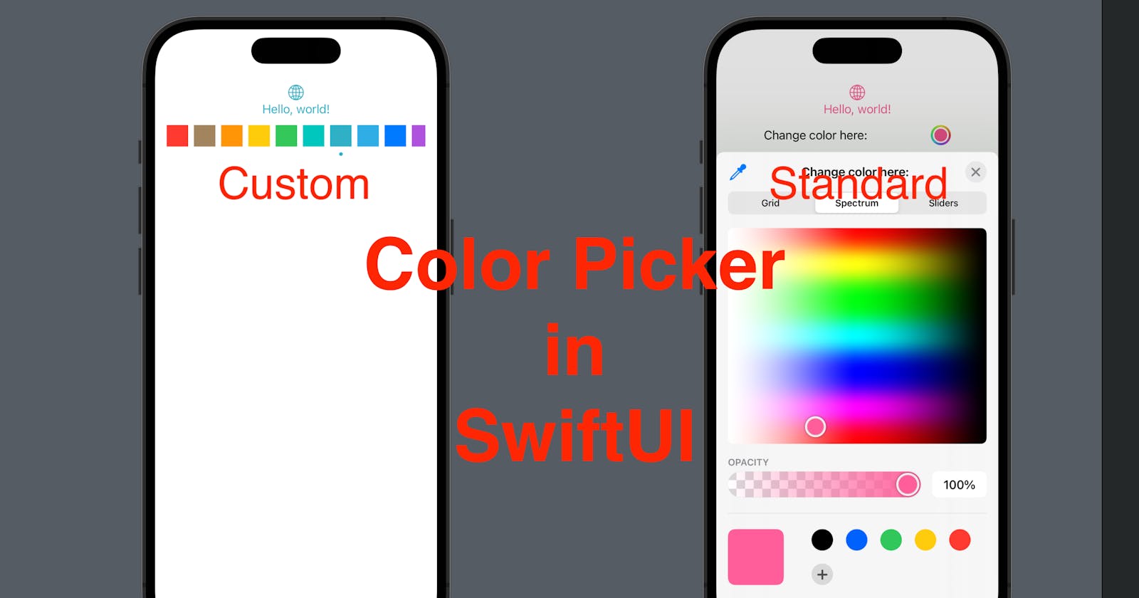


In today’s post, we going to add a color picker to our SwiftUI view, in two ways: a standard SwiftUI color picker and a customized picker.
The source code of this demo is available here.
Part 1 - Standard SwiftUI ColorPicker
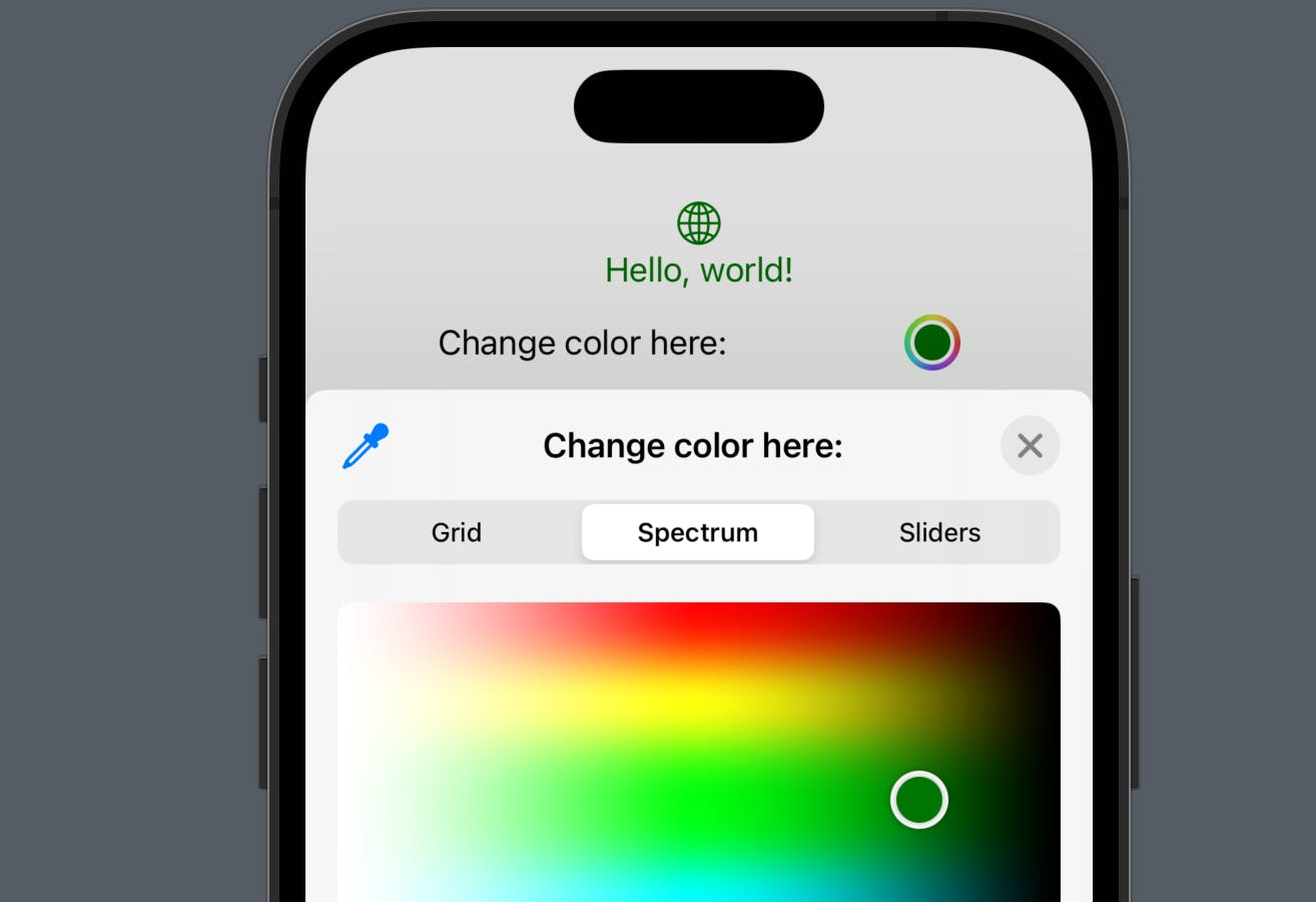
ColorPicker is a SwiftUI view, which allows the users to pick a color with:
grid,
spectrum, or
sliders (enter RGB values by sliding or keying in the decimal/hexadecimal values),
and the ColorPicker view can be initialized with a state and a view content.
Now let’s add a picker to the default ContentView, where the user can pick a color and make it the color of the string "Hello, world!" and the globe icon.
Step 1 - Declare a state property in the view
In the default content view struct, we need to declare a state property of type SwiftUI Color, in order to let the view know the color selected by the user. Let’s give it an initial value (i.e. .indigo in the sample code below).
struct ContentView: View {
    @State private var selectedColor: Color = .indigo
    var body: some View {
        VStack {
            Image(systemName: "globe")
                .imageScale(.large)
                .foregroundColor(.accentColor)
            Text("Hello, world!")
        }
        .padding()
    }
}
Step 2 - Update the modifiers for the elements
Since we have a color property now, we can update the foreground color modifier with the value selectedColor for the globe icon and add this modifier to the text too.
struct ContentView: View {
    @State private var selectedColor: Color = .indigo
    var body: some View {
        VStack {
            Image(systemName: "globe")
                .imageScale(.large)
                .foregroundColor(selectedColor)
            Text("Hello, world!")
                .foregroundColor(selectedColor)
        }
        .padding()
    }
}
Now you can see both elements are in indigo in the preview.
Step 3 - Add ColorPicker in the VStack
Now let add a ColorPicker element after the "Hello, world!" text element. Select the initializer with selection and label . Pass our selectedColor state with a dollar sign, to selection and add a text to label as a hint or a message for the user.
And add a Spacer() below the color picker to push all elements to the top so that you can see the elements’ foreground color is changing when the selected color gets changed.

struct ContentView: View {
    @State private var selectedColor: Color = .indigo
    var body: some View {
        VStack {
            Image(systemName: "globe")
                .imageScale(.large)
                .foregroundColor(selectedColor)
            Text("Hello, world!")
                .foregroundColor(selectedColor)
            ColorPicker(selection: $selectedColor) {
                Text("Change color here: ")
            }
            .padding(.horizontal, 50)
            Spacer()
        }
        .padding()
    }
}
Part 2 - Custom Color Picker
Now let’s take a look at how to create a custom color picker. A customized color picker might be useful when the color theme has a list of predefined colors, or if you would like to simplify the picker with some styles. So, before we continue, create a new SwiftUI view file and name it as CustomColorPickerView .
Step 1 - Copy ContentView partially
First, copy the state property we added and the body of ContentView and paste it in the CustomColorPickerView . Remove the color picker (only leave the VStack with the icon, text and spacer). Once done, you should see an indigo globe and a text in indigo in the preview, placed at the top of your preview device screen.
struct CustomColorPickerView: View {
    @State private var selectedColor: Color = .indigo
    var body: some View {
        VStack {
            Image(systemName: "globe")
                .imageScale(.large)
                .foregroundColor(selectedColor)
            Text("Hello, world!")
                .foregroundColor(selectedColor)
            .padding(.horizontal, 50)
            Spacer()
        }
        .padding()
    }
}
Step 2 - Add an array of Color elements
Now we need an array of Colors for the users to pick a color from.
private let colors: [Color] = [
    .red,
    .brown,
    .orange,
    .yellow,
    .green,
    .mint,
    .teal,
    .cyan,
    .blue,
    .purple,
    .indigo
]
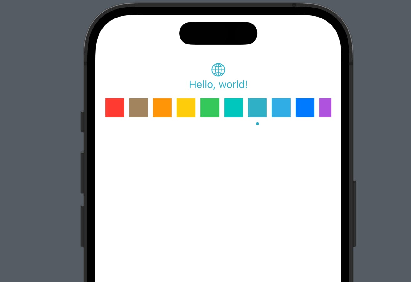
Step 3 - Add a ScrollView to display the colors
This ScrollView contains a ForEach that iterates over the colors in the array we added in Step 2. For each color, there will be a Rectangle() (i.e. square) with the foreground color of this color. And if the color is the same as the selected color, another small circle will be added below the rectangle.
PS: Of course, you can use a vertical scroll view, a circle for each color, if they fit with your UI.
ScrollView(.horizontal) {
    HStack(alignment: .top) {
        ForEach(colors, id: \.self) { color in
            VStack {
                Rectangle()
                    .frame(width: 30, height: 30)
                    .foregroundColor(color)
                if color == selectedColor {
                    Circle()
                        .frame(width: 5, height: 5)
                        .foregroundColor(color)
                }
            }

        }
    }
}
Now we can see the colors, the next step will be: updating the state when a color is selected.
Step 4 - Add onTapGuesture to update the state
VStack {
    Rectangle()
        .frame(width: 30, height: 30)
        .foregroundColor(color)
    if color == selectedColor {
        Circle()
            .frame(width: 5, height: 5)
            .foregroundColor(color)
    }
}
// ------- new lines here
.onTapGesture {
    selectedColor = color
}
On tap of the VStack of a specific color, the state property will get updated to the selected color. i.e. in the screenshot below, I selected teal and the foreground color of the globe icon and the text gets updated too.
That’s all about color pickers. We looked at both standard and custom color pickers in SwiftUI. Hope this article is helpful and remember to subscribe to my newsletter. See you all tomorrow!